Compound Centric App
Company: Merck
Category: Software Development
Team: Data Scientist, Frontend Engineer, Associate Director Design (myself) - design and code for data visualization
Role: End-to-end product (I did research and interviewed users, designed wireframes, and prototyped the visualization)
Date: June 2021
Background
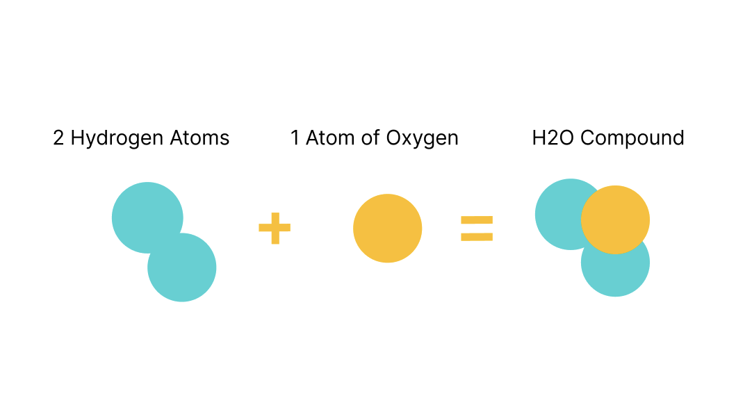
The work flow that scientists at Merck are going through is that they would go on Chem Chart software to check how well a compound did. The problem was that a lot of the times they couldn’t find a specific compound and they were never able to see how well a compound did through testing on the same page with the compound’s chemical structure. It was a very time consuming and not an effective way of working. A compound is a chemical substance composed of many identical molecules containing atoms from more than one chemical element held together by chemical bonds. A molecule consisting of atoms of only one element is therefore not a compound.
Problem
How might we quickly and effectively analyze and visualize how well a compound did throughout testing?
Discovery: Research & User interviews
The UX team and myself met with the scientists every week to brainstorm how can we build something that would be useful to them. We interviewed 12 scientists. We learned about their day-to-day work, about organic chemistry and their pain points. We learned about atoms, molecules and compounds. We started using Chem Chart software to understand better their workflow and pain points. We had to become experts in organic chemistry in order to understand their needs and be able to design the most useful app.
Personas
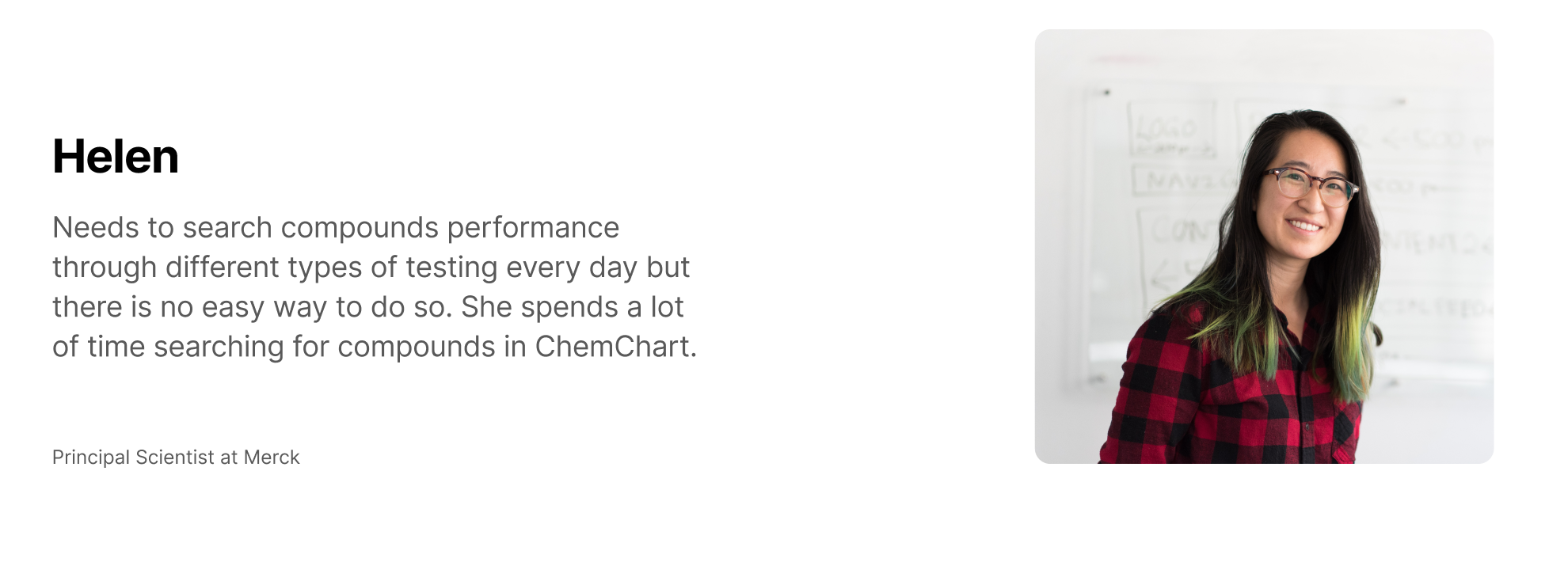
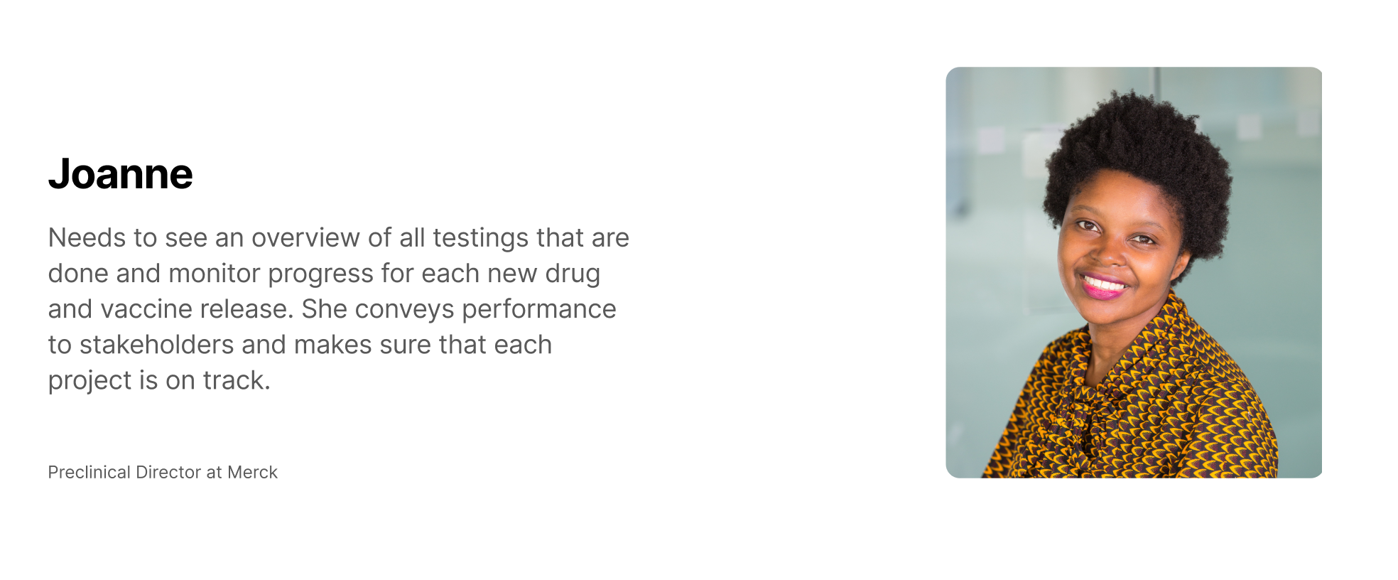
Our users were scientists from Merck, as well as Product Owners and Merck leadership. We were building this tool internally at Merck, so we had the opportunity to interview and talk to more than 100 research scientists to find out how are they working and how could we make their lives easier. We designed these 3 personas so we can incorporate user scientists and business people in these personas.
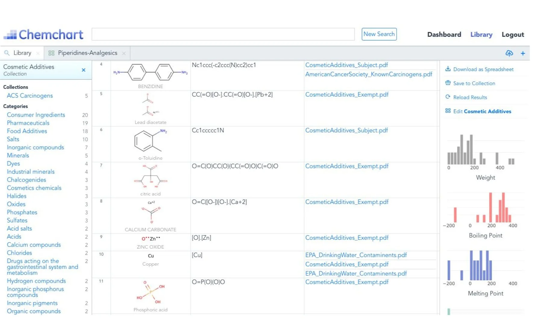
Evaluation of the current tool used by the scientists
The UX team and I started playing around in Chem Chart to see how long it would take us to find one compound’s performance through 7 assays and the result was about 2 hours. We felt like that this was unacceptable and that we have to build something better. What was even worse was that one could not see the chemical structure of the compound in the same place with the testing result, which we also felt it was terrible.
Design Thinking and Strategy
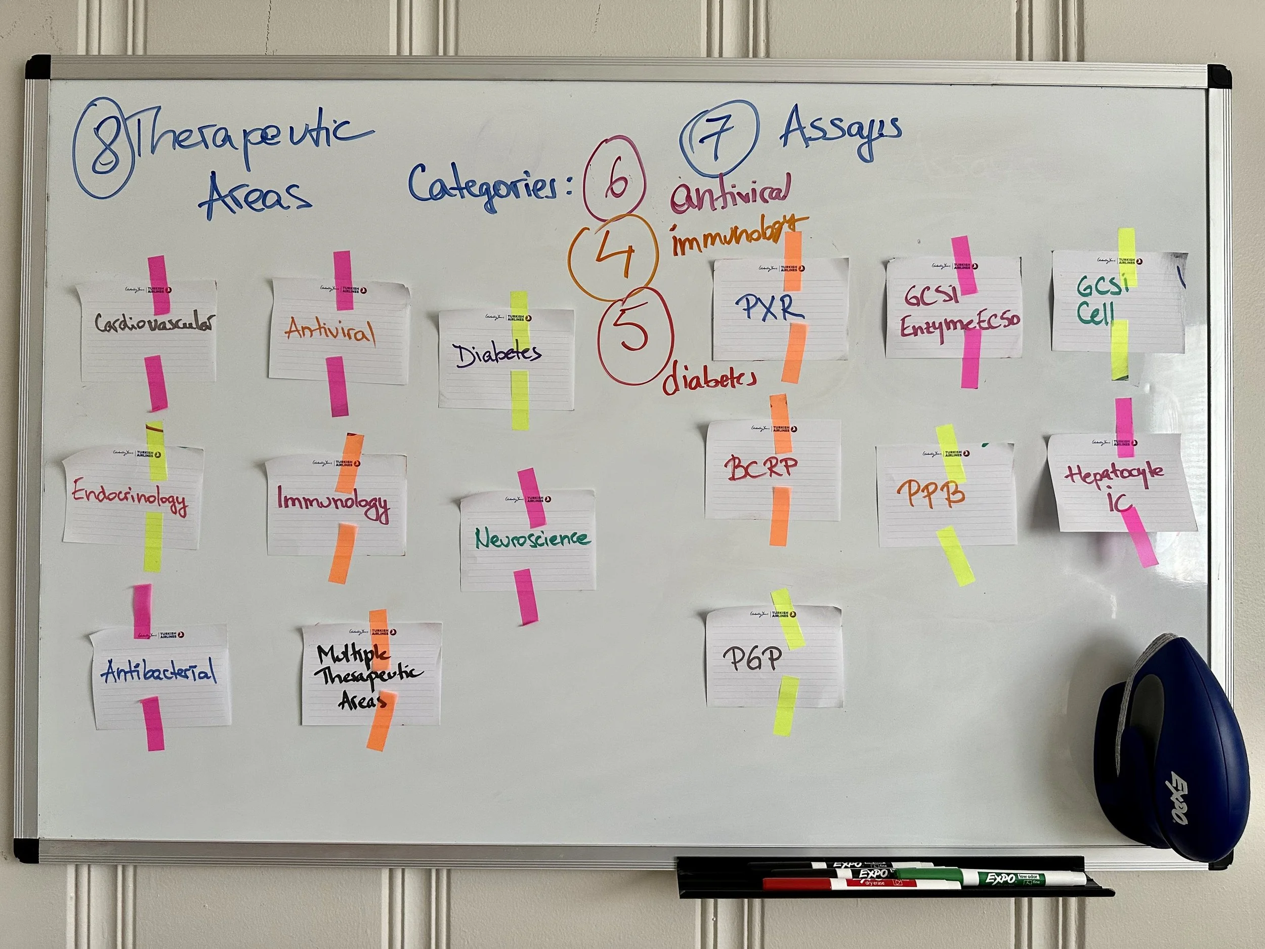
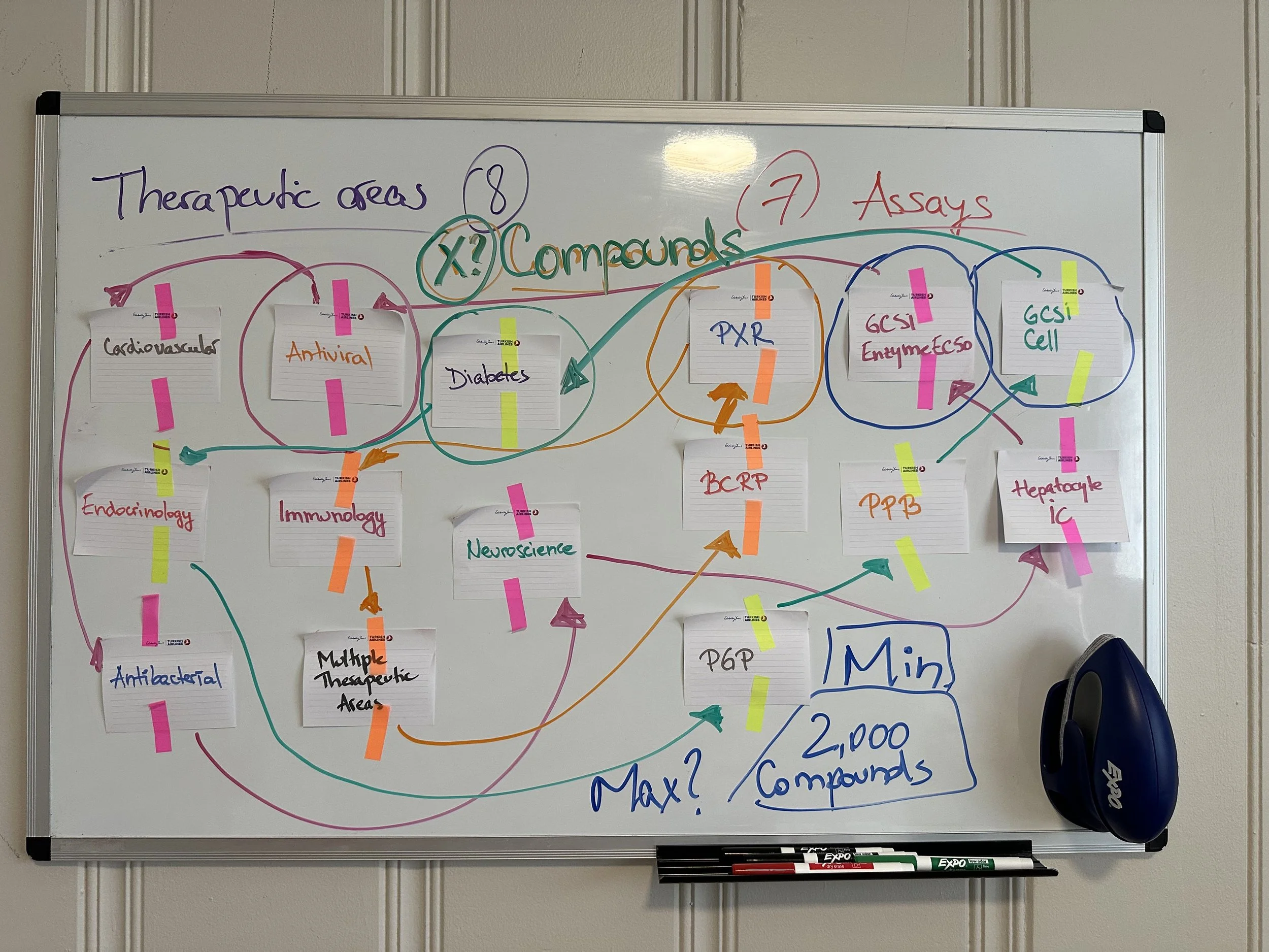
The first thing we did was to brainstorm on a whiteboard what’s the problem and what could be the solution. I love white-boarding because sometimes the best ideas come from whiteboard sketching. What I first did was to write down the Therapeutic Areas and Assays to check if I could categorize the data. One thing about this project was that at this point we weren’t given the real data, just a mock data and looking into the mock data could lead us to design a tool and miss some information. However, we wanted to prove that we can design something useful to scientists. So I looked into grouping this data and trying to find out how many compounds I could visualize in this tool. The maximum number that I came up with was 2,000 compounds. I knew that visualizing more than that would mean making certain compromises.
Brainstorming
One of my favorite part of the design process is brainstorming Problem/Solving approach. What is the problem we’re trying to solve and what are all solutions that we can come up to? I wrote down all problems that scientists were facing, all solutions that came into my mind as well as app features and all potential users.
Solution
Based on the stakeholder’s feedback, the team and I decided to build a software tool that would connect to the API, it would include a visualization, and scientists can filter to find which compound did well through which testing as well as the chemical structure.
Hand Sketches
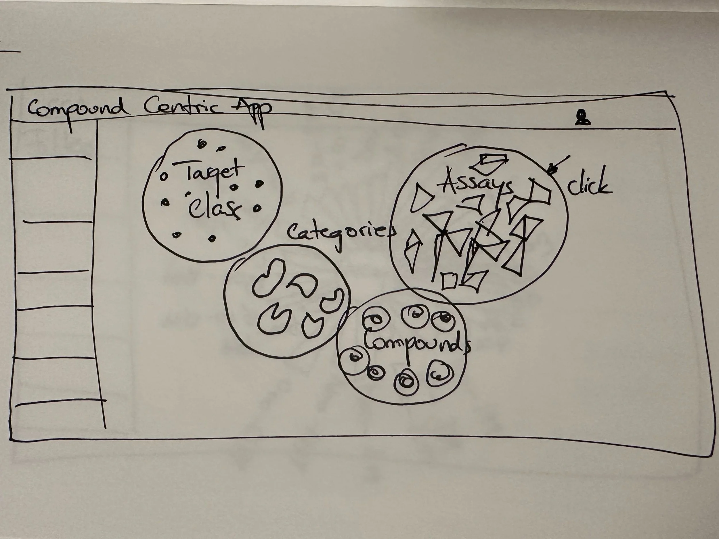
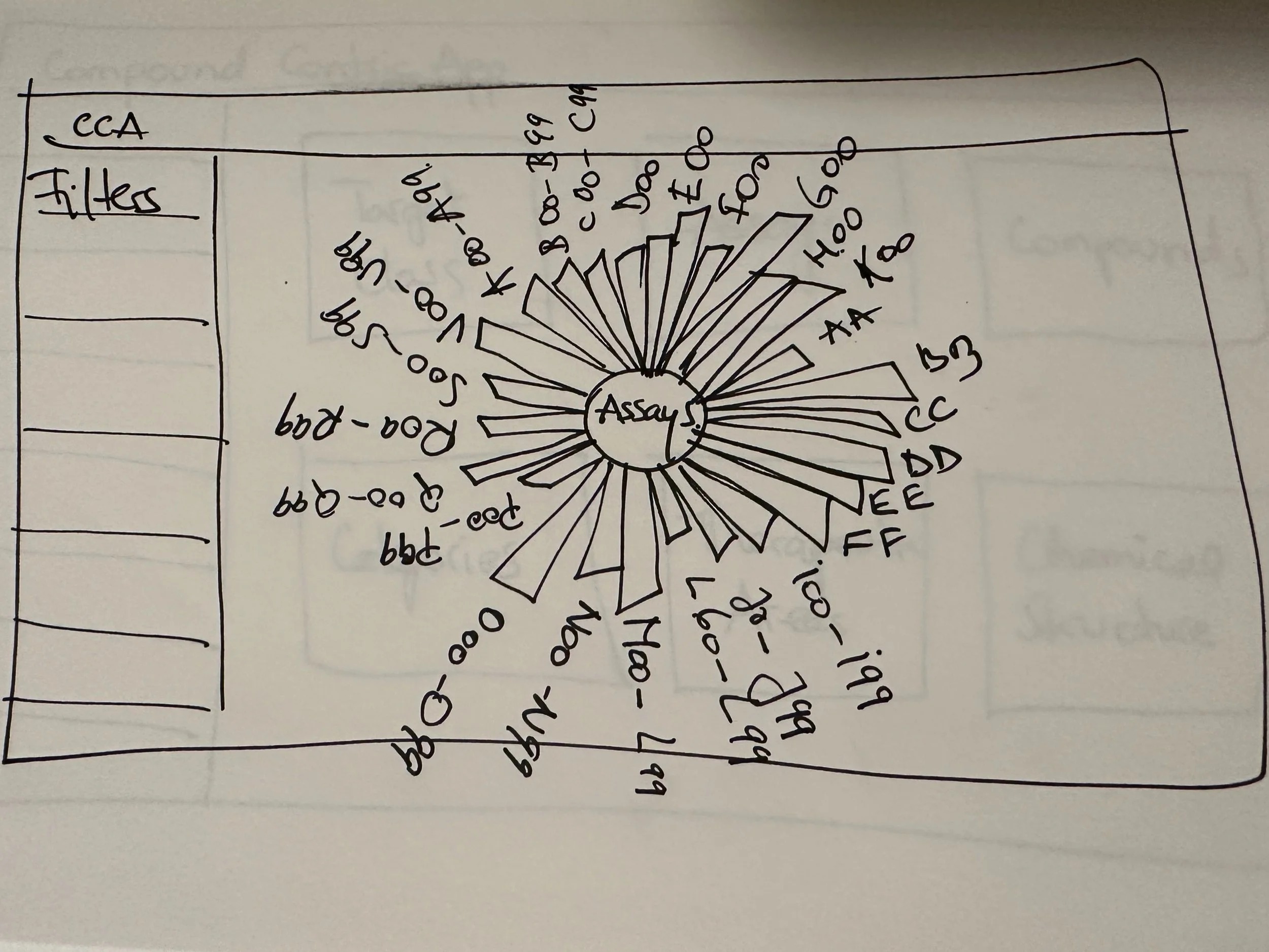
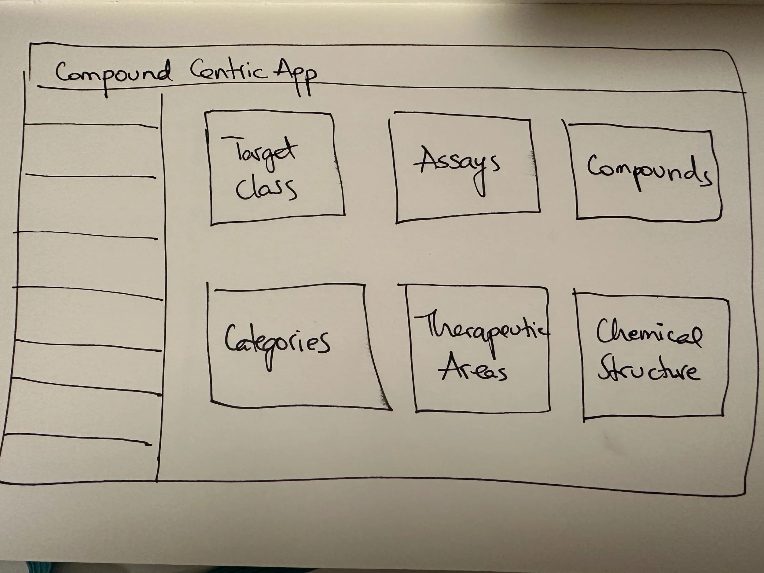
The first thing I like to do when I start designing the product is to sketch by hand how would this software look. My first idea was to group the data by categories and to design different types of molecules in those circles. Once the user clicks on one circle, it could open up a ‘sunflower’ shape, where each bar represents one compound. My second idea was to use ‘blocks’ for each category and have a more simple and effective design. Once the user clicks on one block, the same radial bar chart would open up. The latter design got chose by our stakeholders due to being more simple and clean.
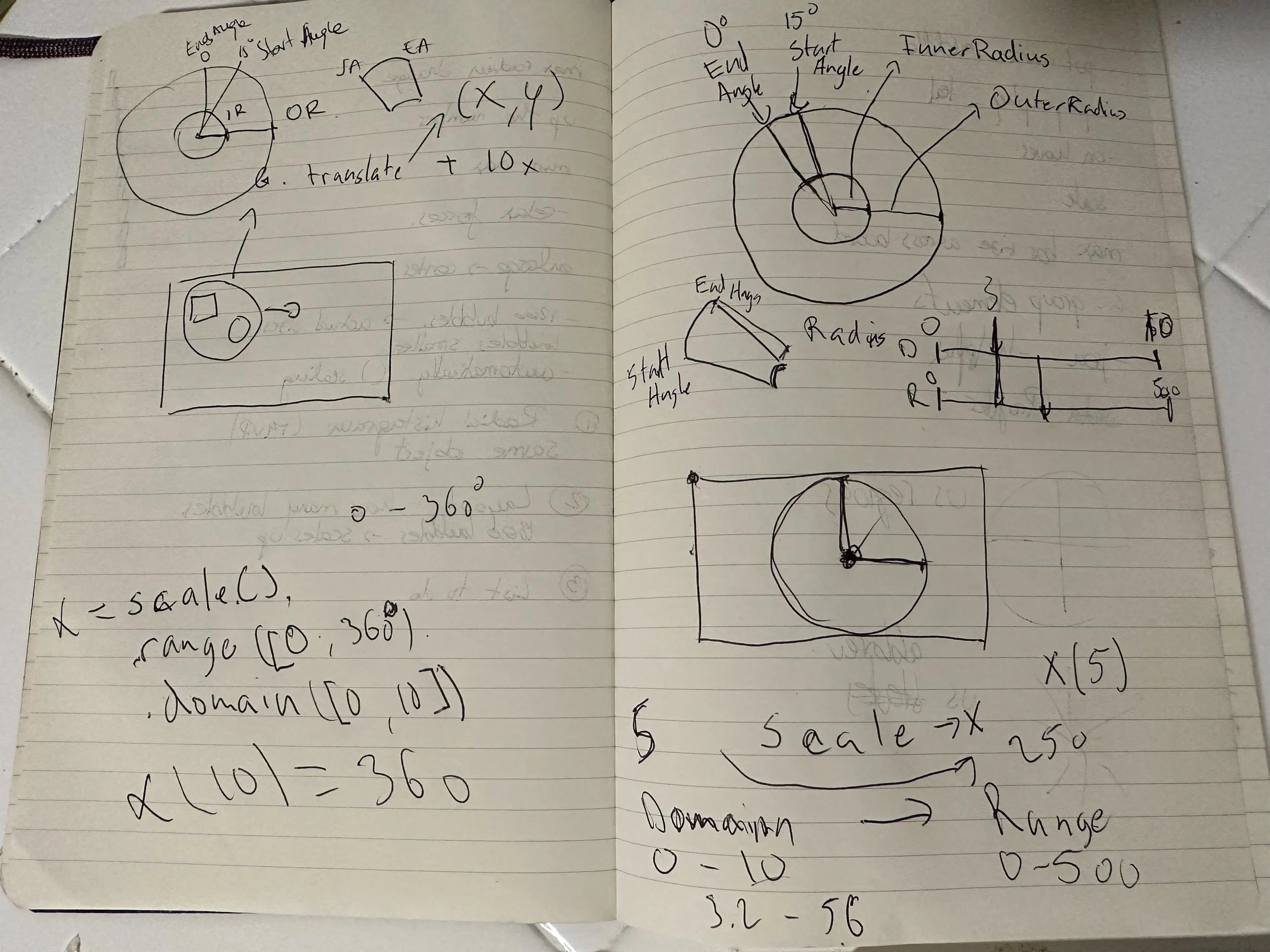
Once I knew how the design would look like approximately, I started calculating how would the data map on the circle and how would I prototype this design. I was trying to figure it out if this design would be feasible using this data.
First Design Iterations
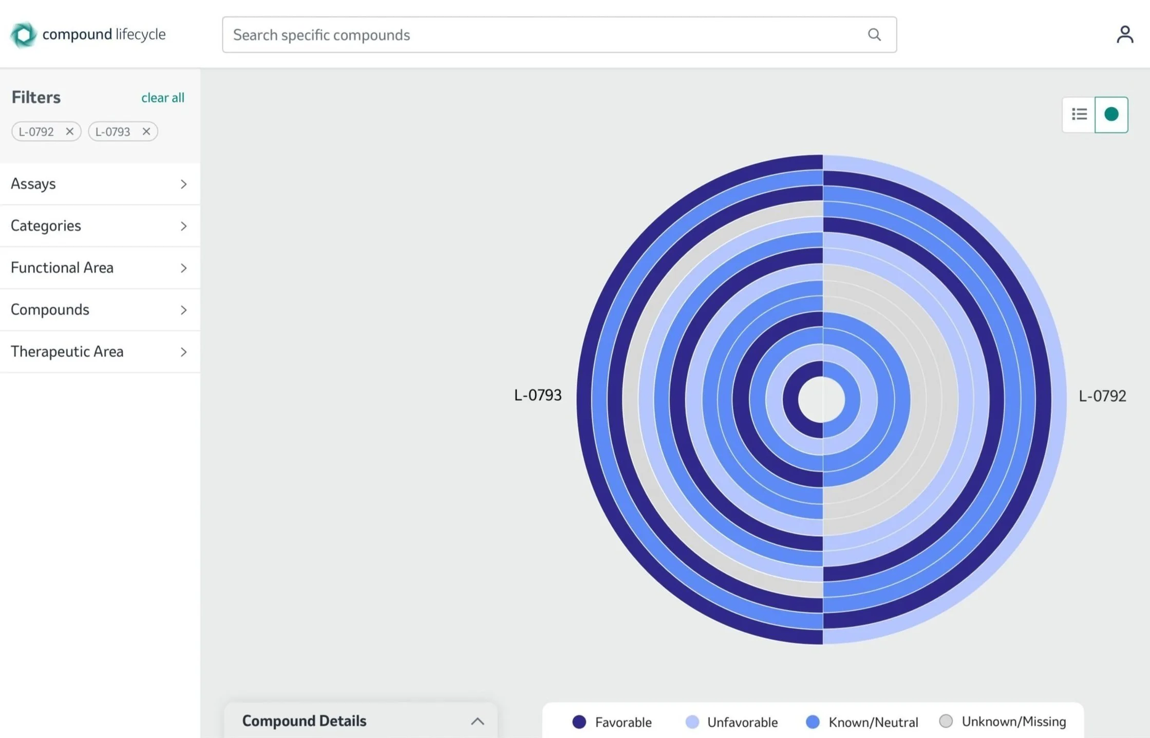
After a few design iterations and continued meetings with scientists, I ended up deciding on this visualization. The data here is represented in a radial bar chart. I iterated this design with the users, the scientists because I believe including the user during the design process is critical. After multiple meetings with them, we agreed upon showing a finite number of compounds in a radial bar chart, and each radial bar represents a compound number.
Initial Compound View
Compound Picker View
First Iterations
After the first design iterations we faced the issue as a team that Merck’s API had a massive amount of data so we needed to filter the data before visualizing it. Since our users were scientists at Merck we knew they know exactly which compound or assay they need to see. That allowed us to have more specific design options.
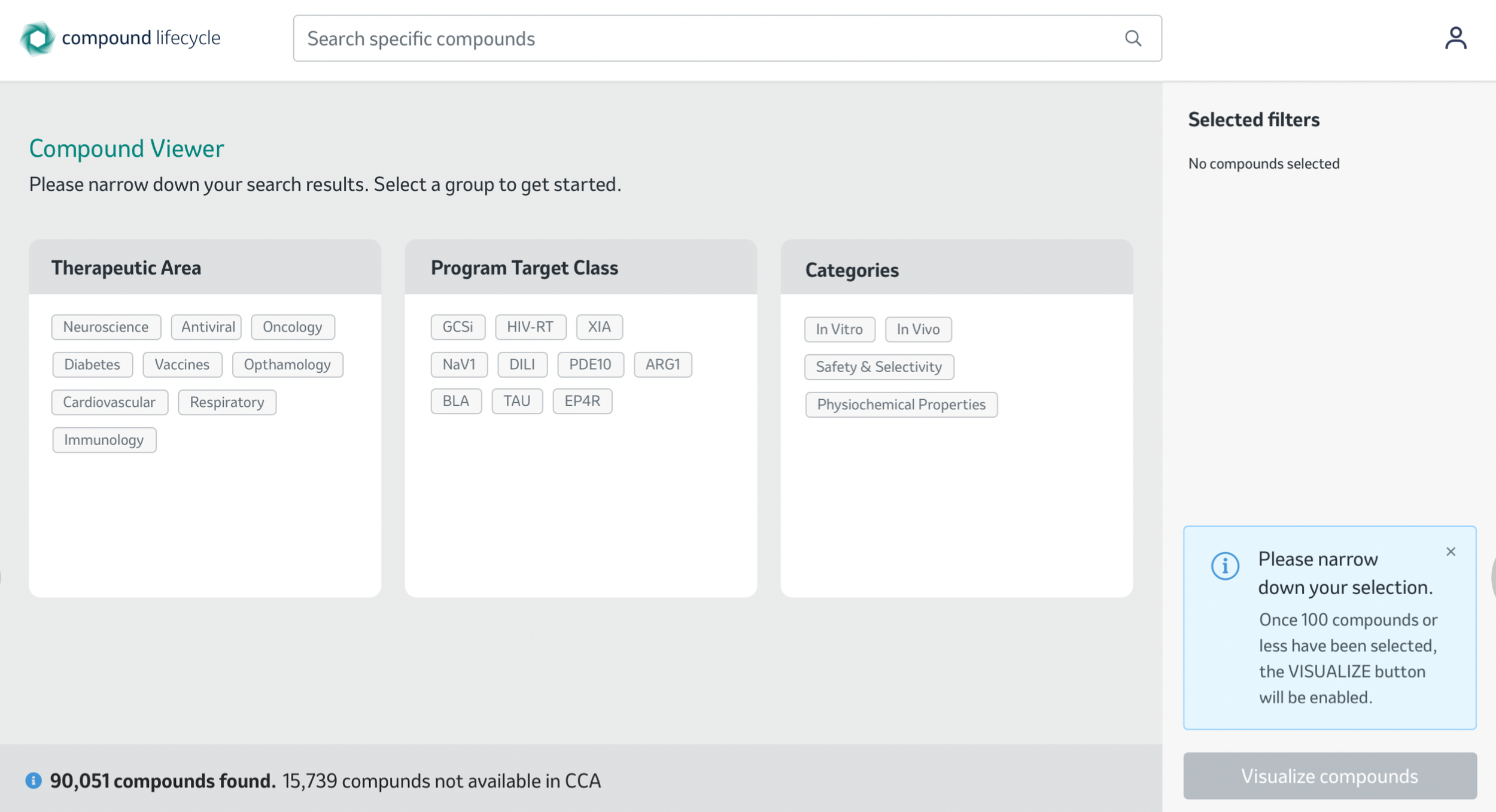
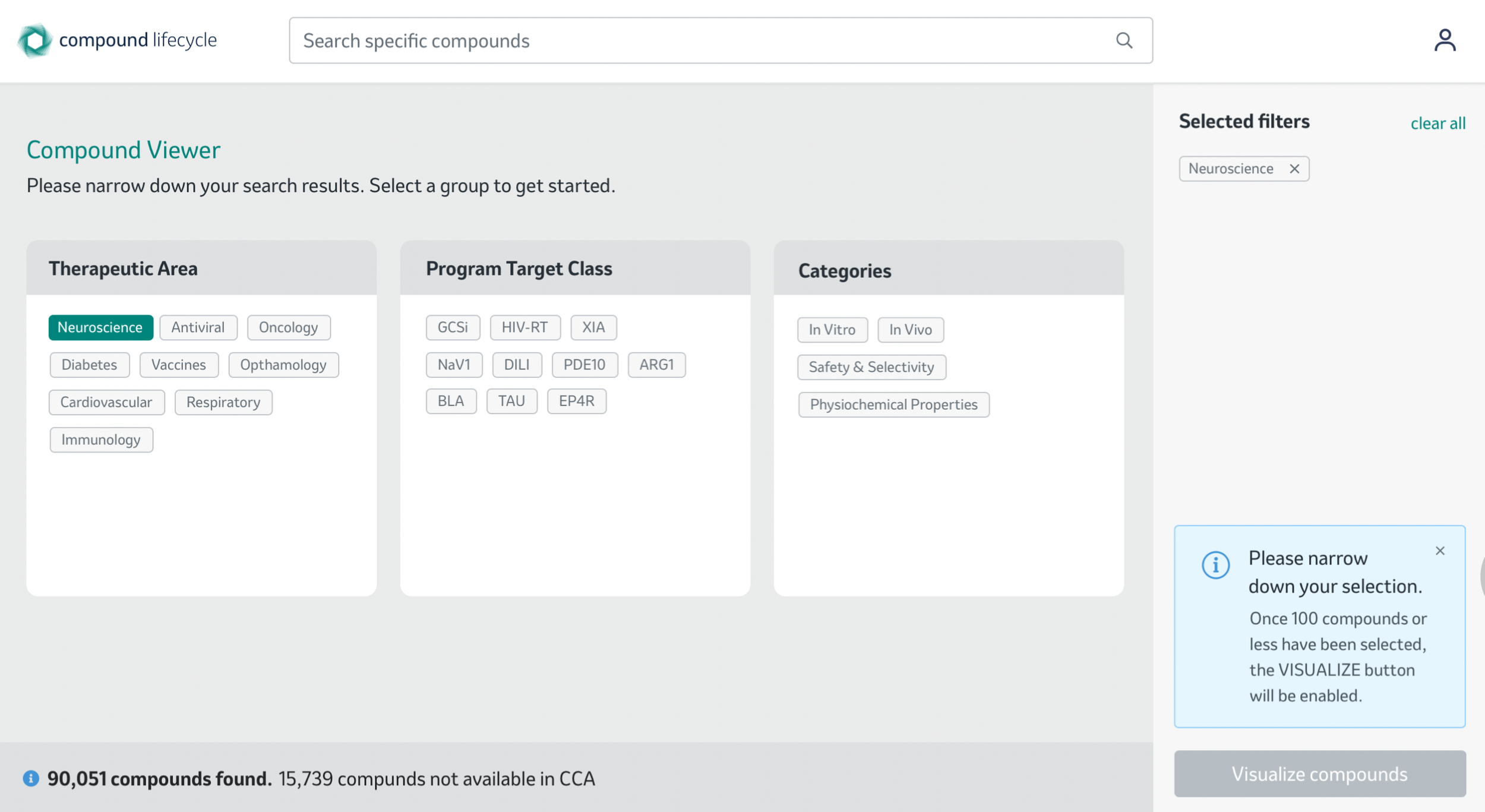
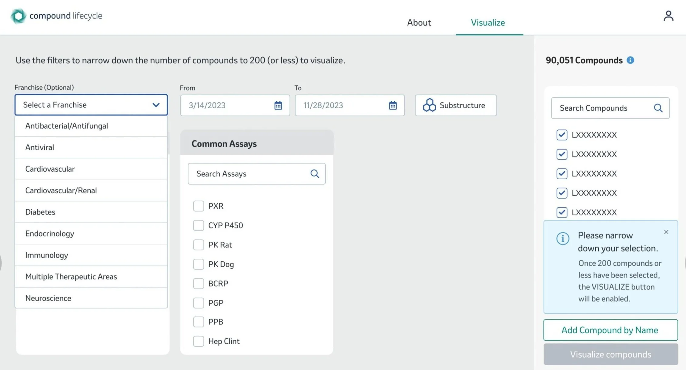
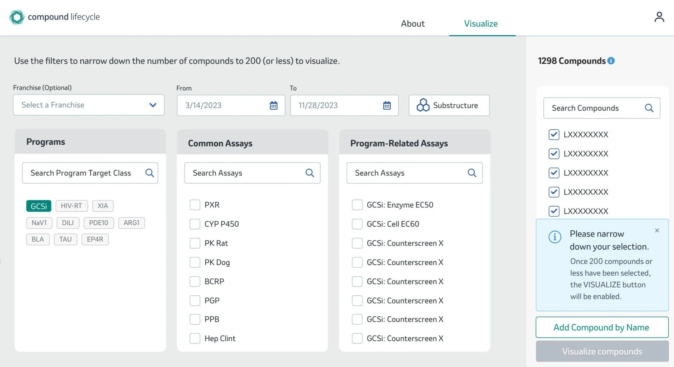
I thought of narrowing down the amount of data by making the user choose which category they want to explore. Here you can see a page that allows the user to add filters to the data. Only once the user has less than 100 compounds, they would be able to view the data in the visualization mode.
The user choses here Neuroscience which narrows down the selection.
Compounds Found
Compounds Expand
Two compounds were found in this selection
Compound bars expand to view more details
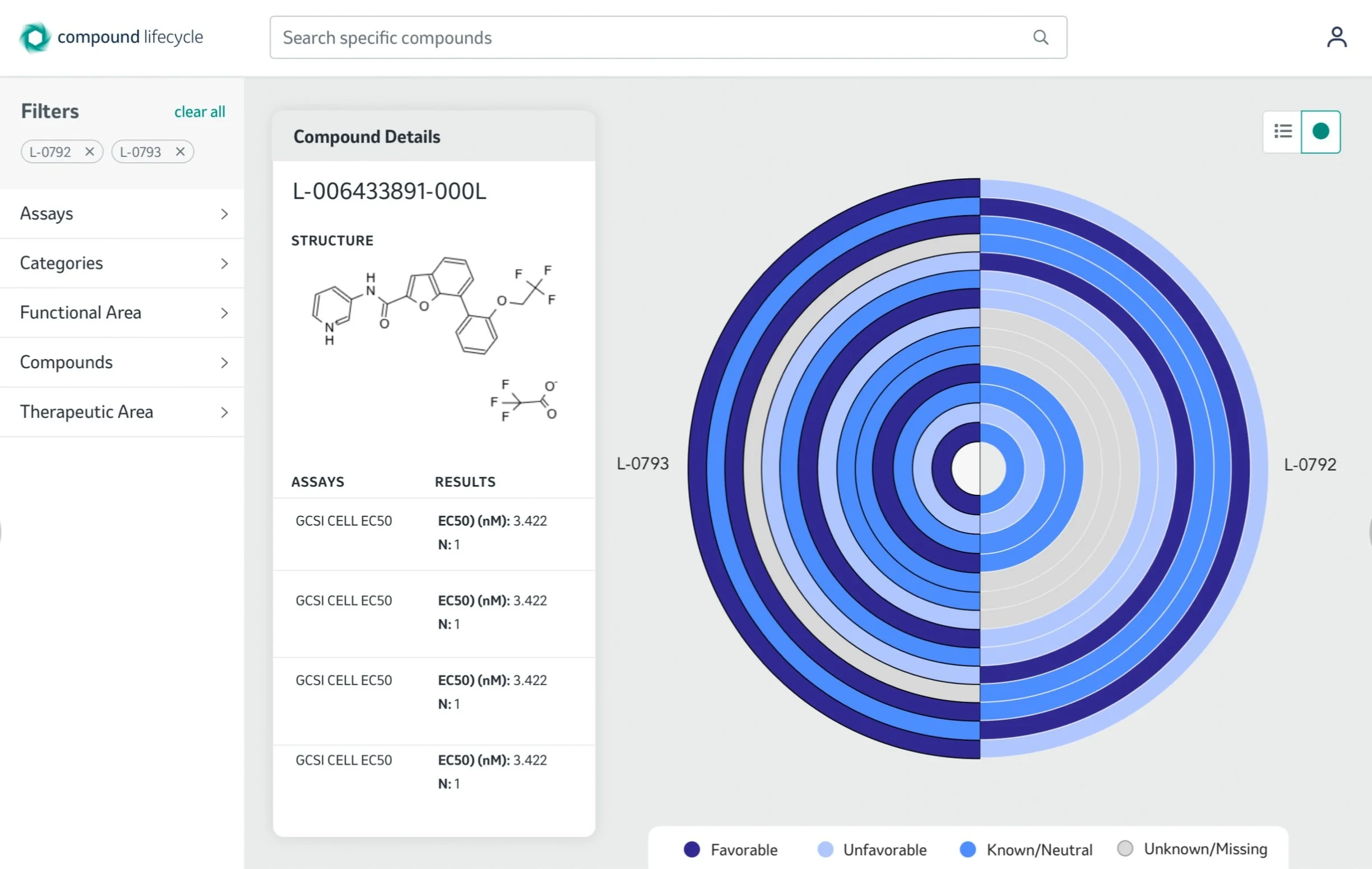
The user can click on compound details to check out the chemical structure.
Visualize Compounds w/ Chemical Structure
The user switches the view to a visualization mode.
Visualize Compunds
Final UI Wireframes
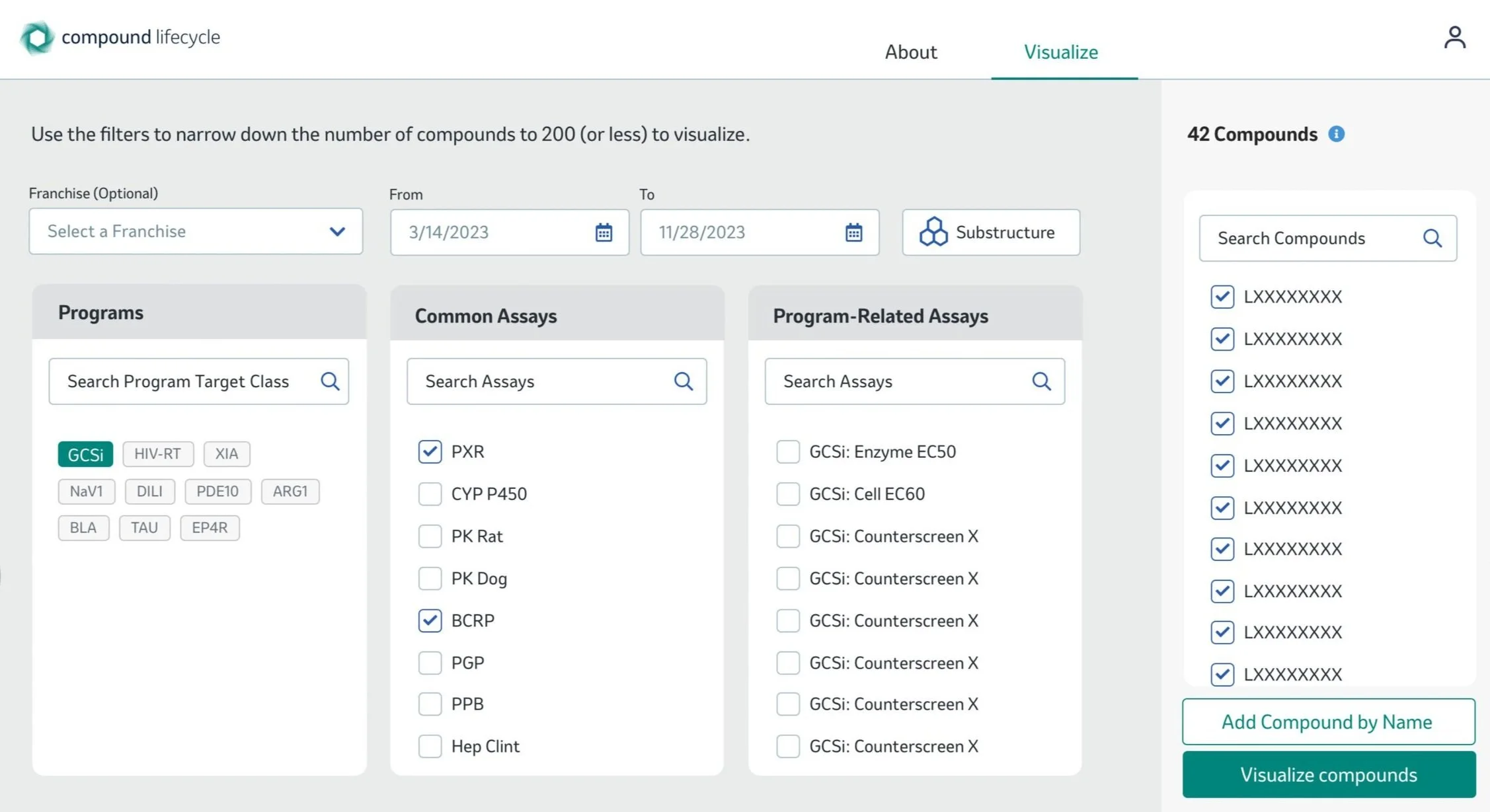
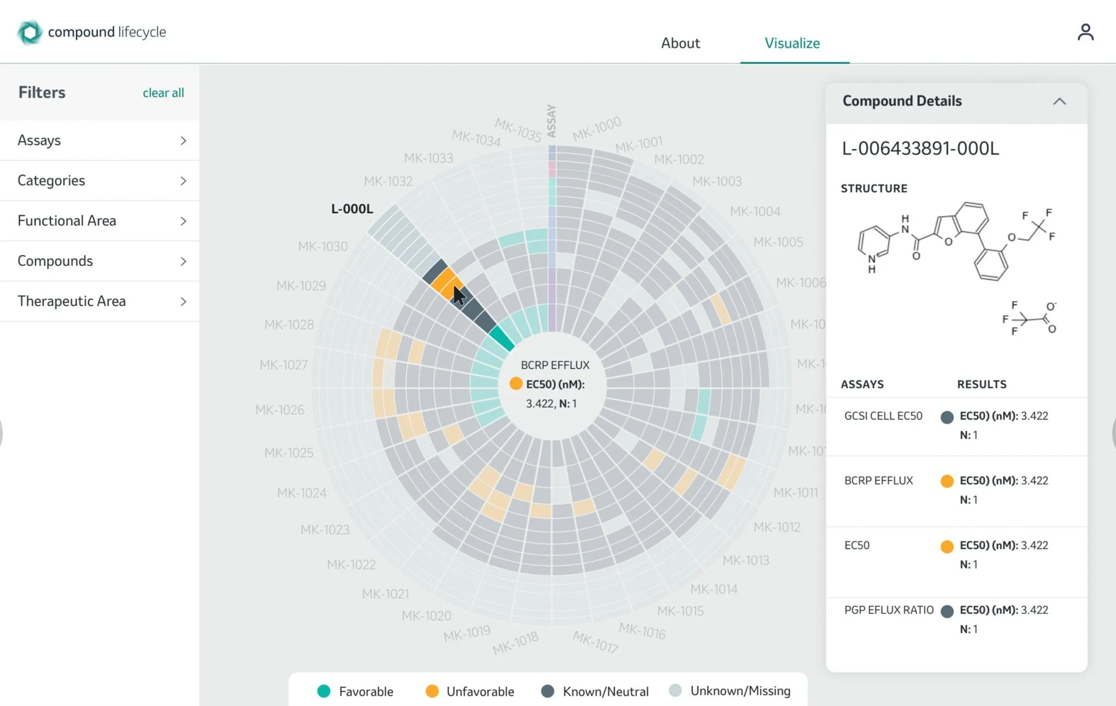
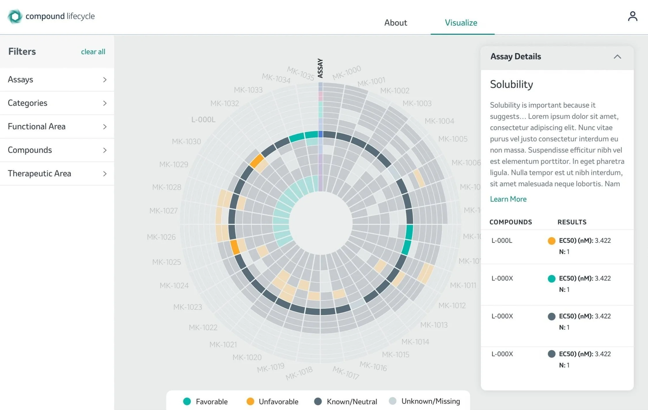
I fine tuned these mock-ups and came up with the finalized user flow. This is where the user starts. Then user selects visualize mode. Choses from the drop down menu which franchise to explore. Decides on GCSI Target Class, which prompts the software to let the user know to please narrow down the selection to 200 compounds. So the user picks PXR and BCRP assays and clicks on visualize compounds. This renders the visualization with the needed compounds. Users decides to click on compound L-000L. And choses to view the solubility assay to compare the compounds against each other as last step.
Compound Centric App
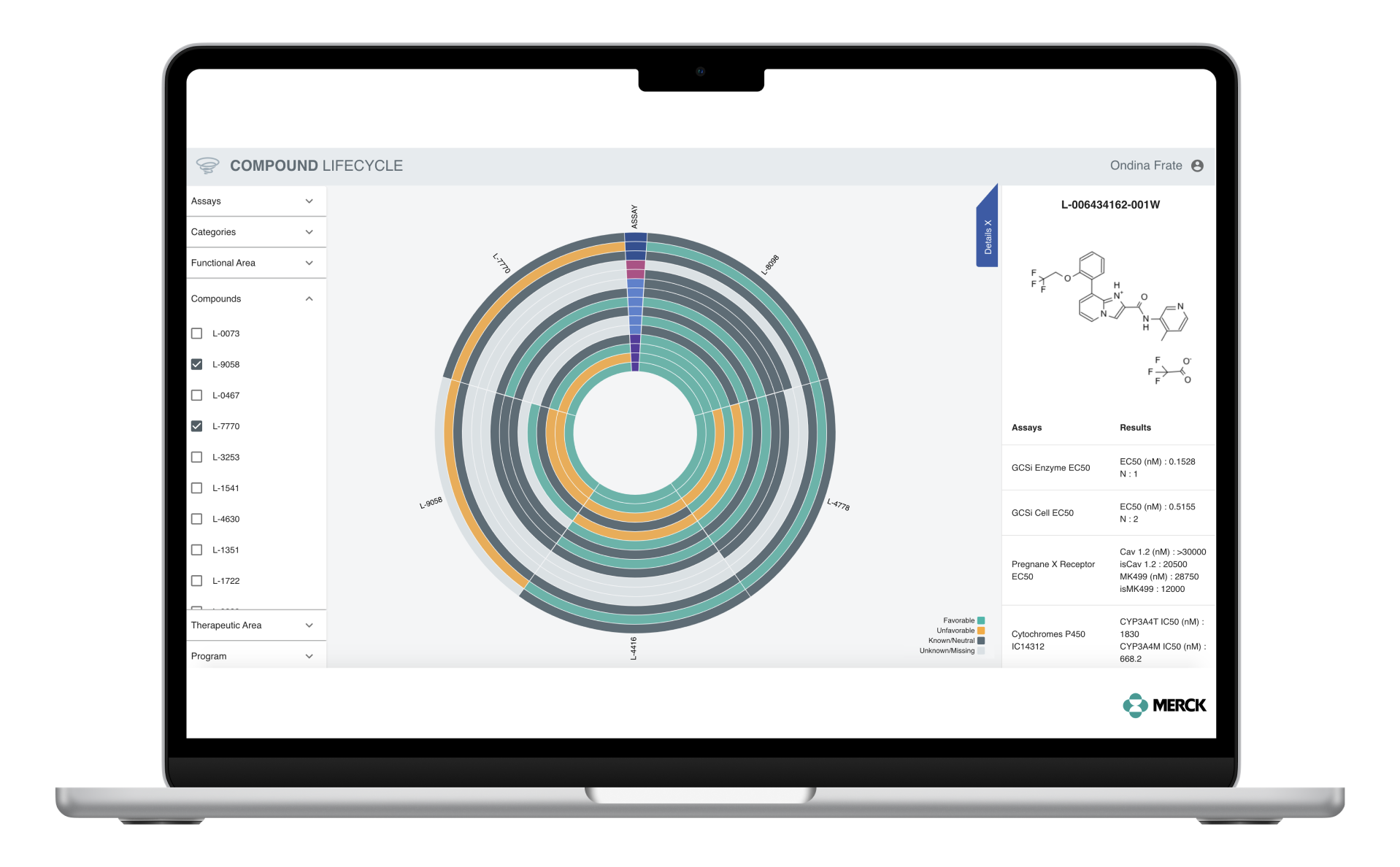
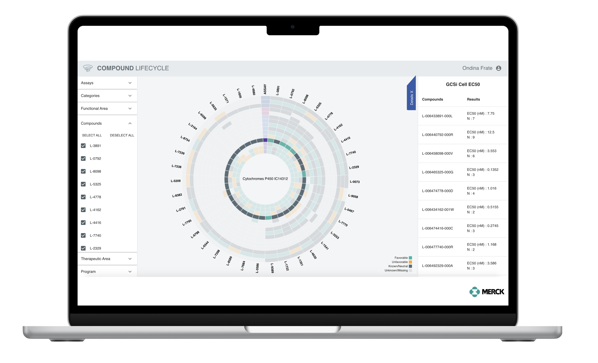
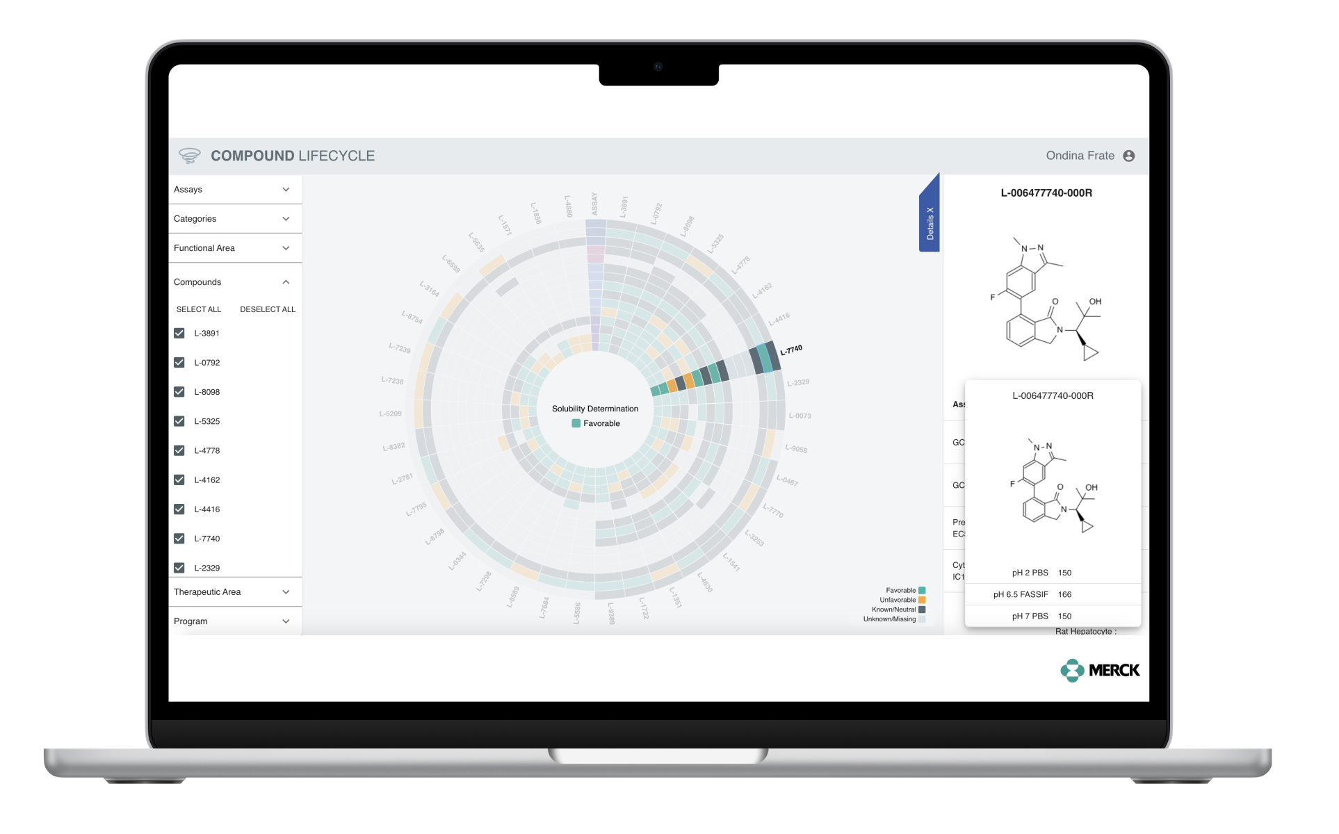
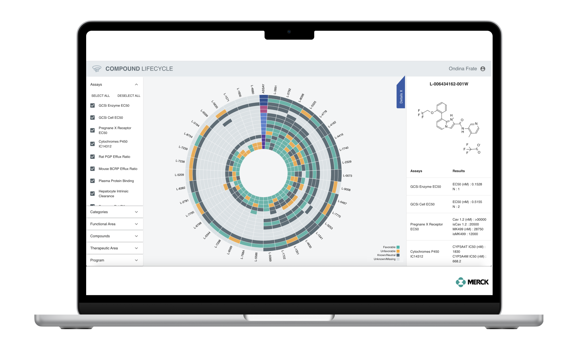
This is the actual app that I’ve designed and prototyped. Green meant it performed well, dark grey meant it was neutral, yellow meant the compound failed testing, and light grey meant that compound was missing. We chose this colors so we can easily see which compounds did well.
Prototype
This is the latest version of the app that I designed and prototyped and then handed over to the Engineers to further develop the software. The users can visualize a compound number and how it did through an assay and based on the needs, can filter on the left side the compounds, assays, or categories.
Impact
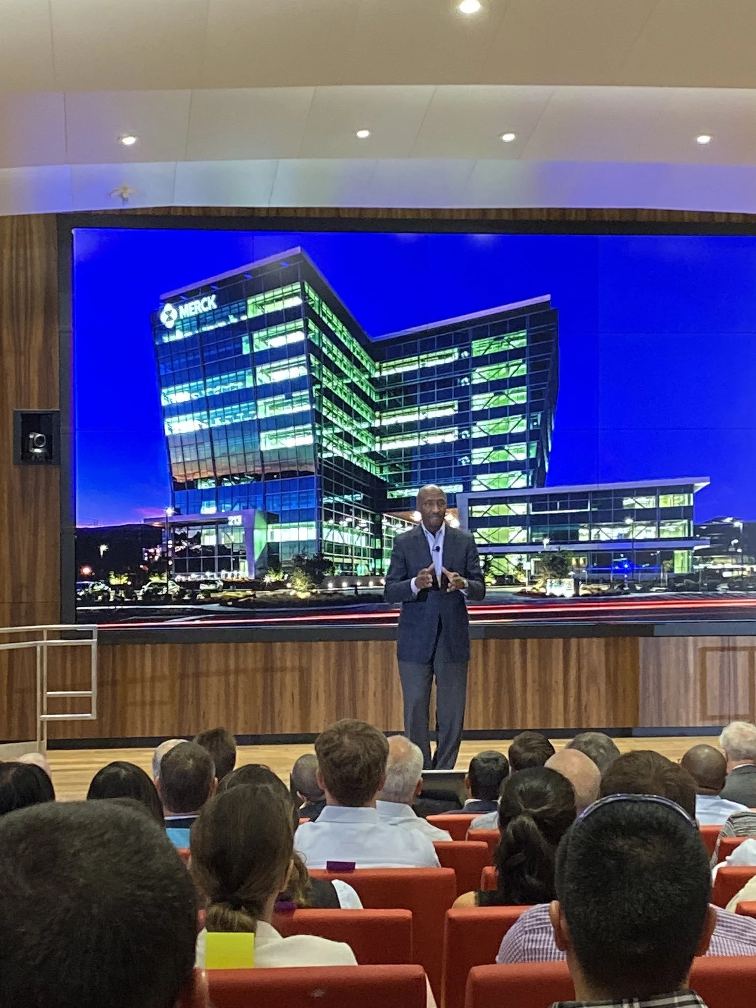
This project was very complex and it allowed me to learn a lot about organic chemistry, about how scientists work at Merck, about cross-function working, and about visualizing a big amount of data. We presented this project at the Merck Tech Symposium in 2020. Scientists at Merck are currently using this app which is saving them a lot of time and they find it very efficient. Merck CEO Kenneth Frazier.
Takeaways
Visualizing a big amount of data is always a big challenge. A designer has to account for issues rising from the non-linear way of working with data (biases, empty rows in data sets, and most importantly not being able to display a big amount of data in one screen). I’ve learned to look for ways to always filter a massive API through my designs so a visualization of a data set could be easier to be comprehended this way. I’ve also learned that one cannot design a software - in this case CCA without becoming expert in what you are designing (in our case organic chemistry). I luckily learned and liked organic chemistry in high school but still had to go back and learn about scientist’s workflow in order to design the best app using a user-centered approach.

