Real Talk for Change
Organization: MIT Media Lab
Category: Website & Data Visualization
Team: UX Designer, 2 Front - end Engineers & myself
Role: Research, Design & Implementation of the visualization
URLs: Data Visualization & RTFC Website
Date: January 2022
Background
I worked on this project while I was a Research Software Engineer at the MIT Media Lab, focusing on research, data analysis, experience design and telling stories using data. We realized that government authorities are not aware of people’s needs and wanted to somehow bridge the gap between communities and government. This project was intended to give a voice to people of Boston before the mayoral election in Boston Fall 2021.
Problem
How can we give a voice to underrepresented communities in Boston?
Research
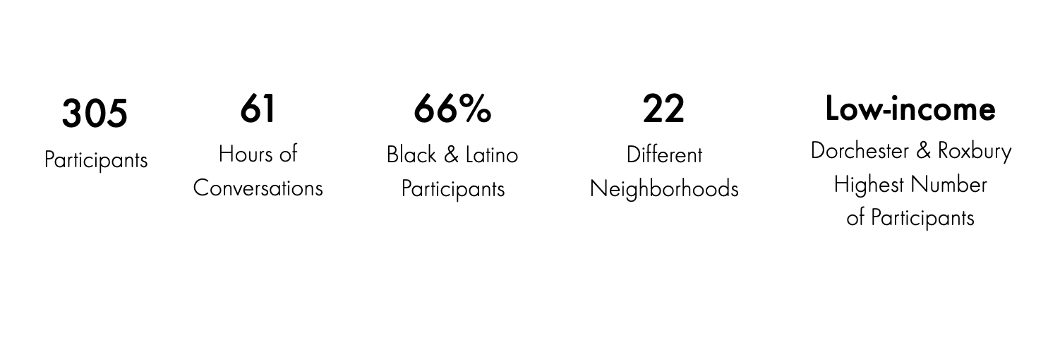
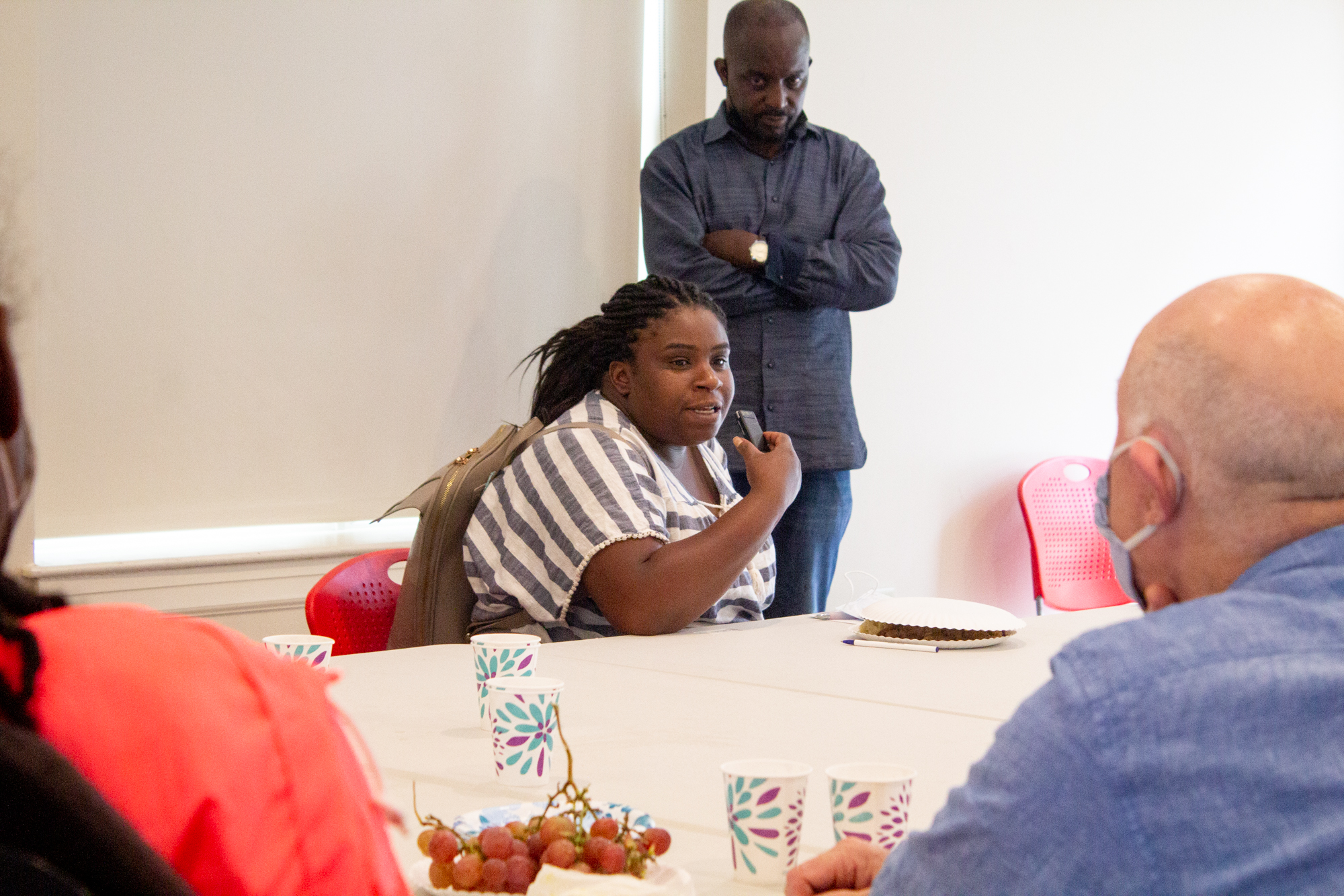
The first thing the team did was to collect data by going out and have conversations with people from underrepresented communities. Our hypothesis was that we could find common themes throughout these communities. We spoke to more than 300 people to find out what are their needs from the upcoming mayor.
Interviews
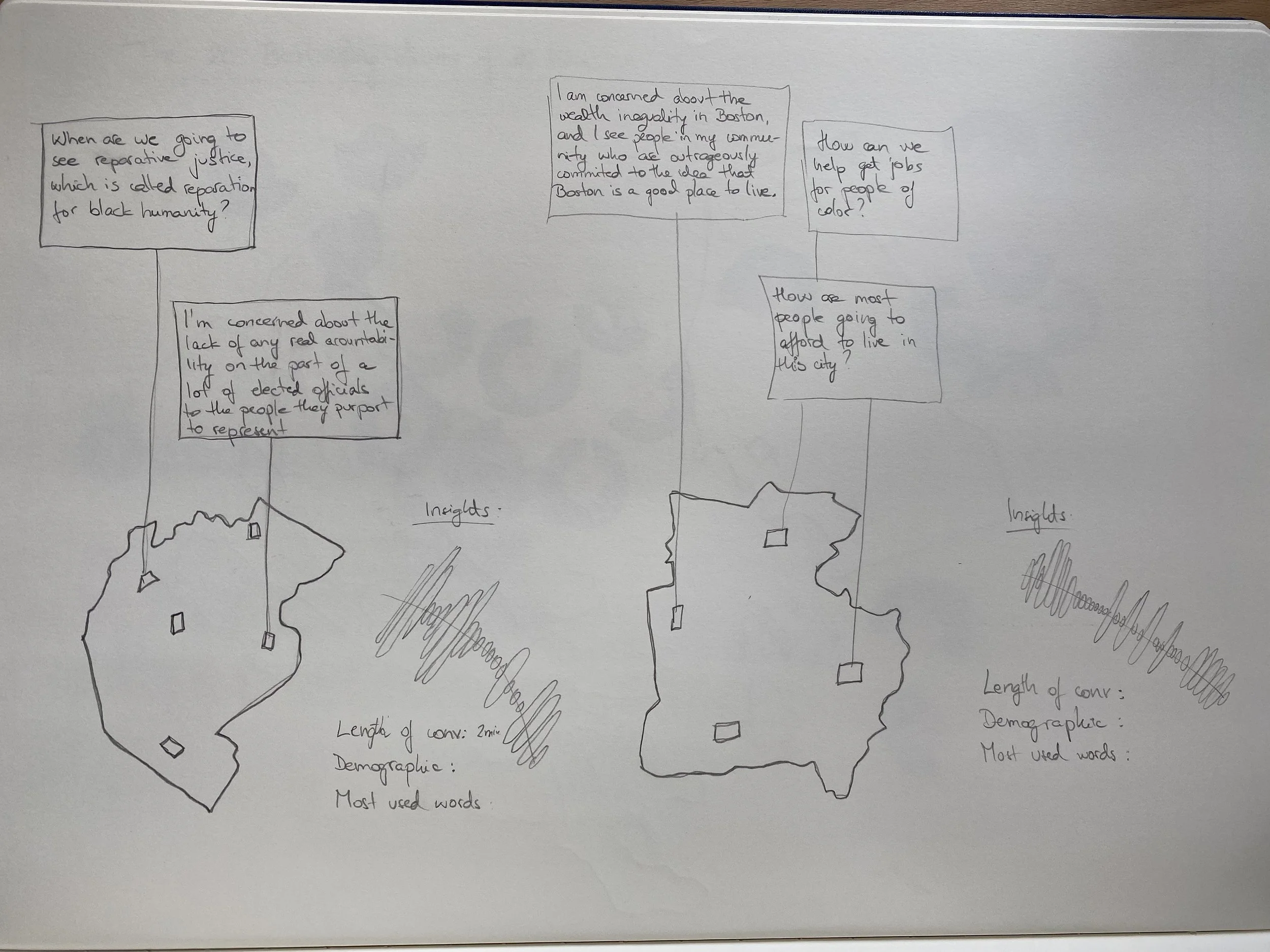
Nancy Sept 21st 2021. “I don’t think any of the candidates really answered this - how can we make housing more equitable in Boston? I’ve been homeless twice due to domestic violence. Actually right when the Long Island shelter was closed”.
Making Sense of the Data

Understanding the data
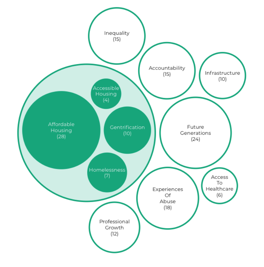
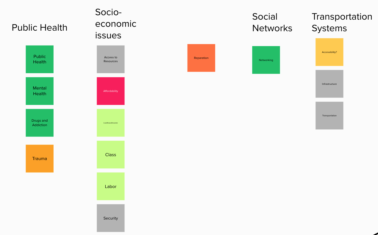
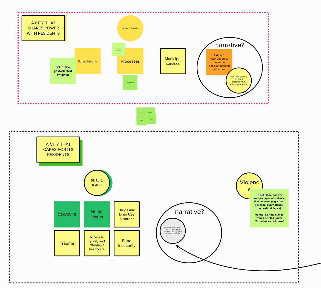
Tagging the data
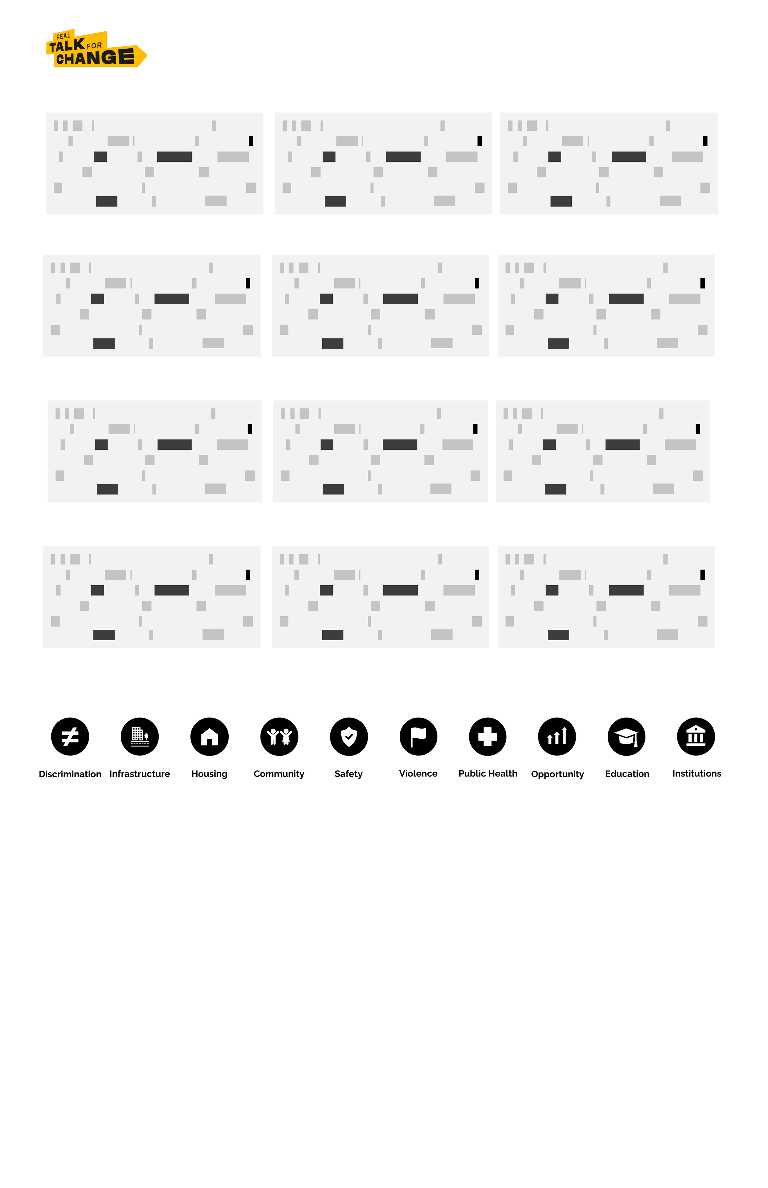
So we started tagging the data based on these themes. Each circle size represents how many times that theme was found throughout all conversations. Here you can see some of the main issues that these underrepresented communities are facing.
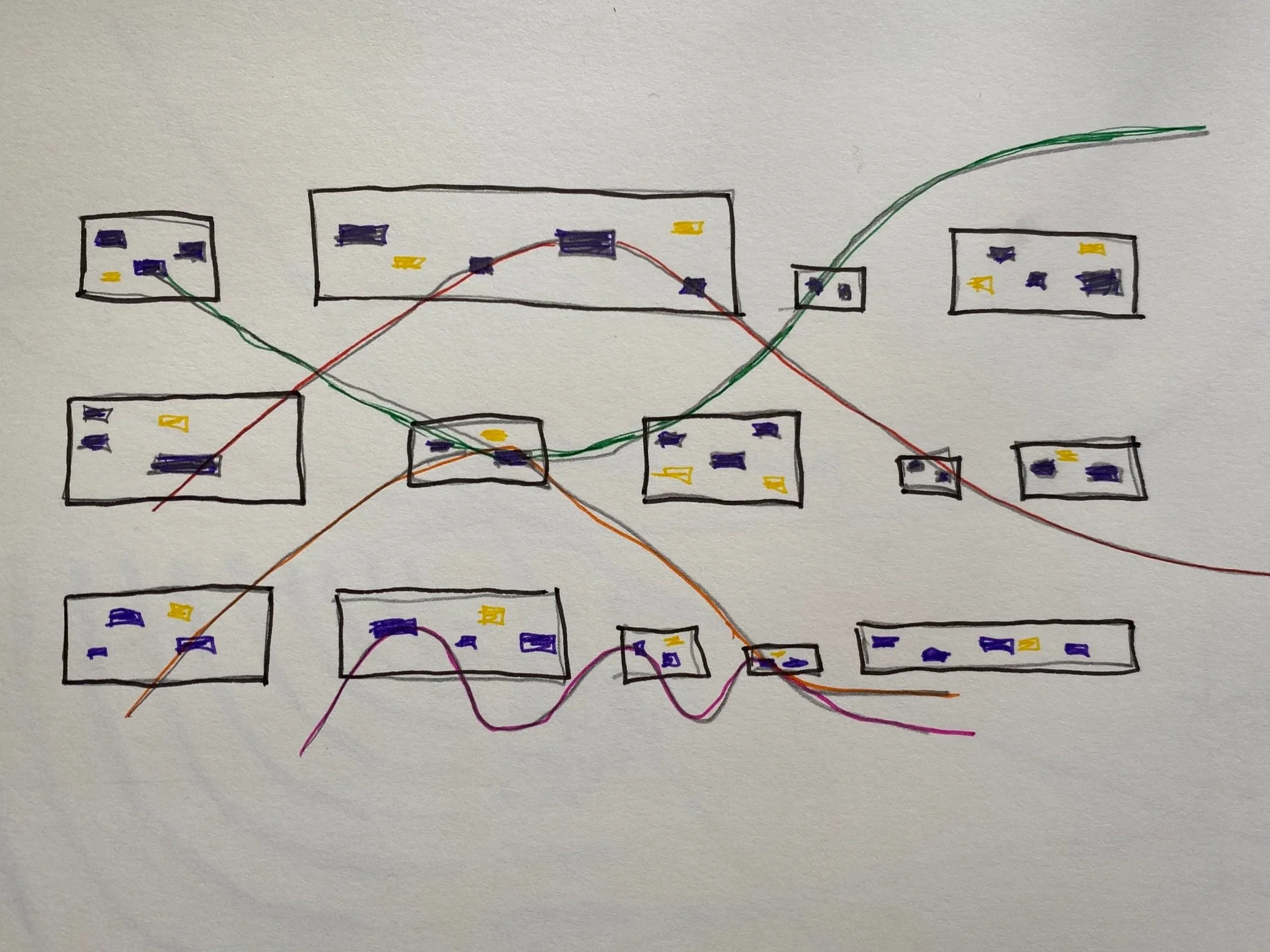
The first thing I did was to draw Boston’s map to check from which neighborhoods are these speakers.
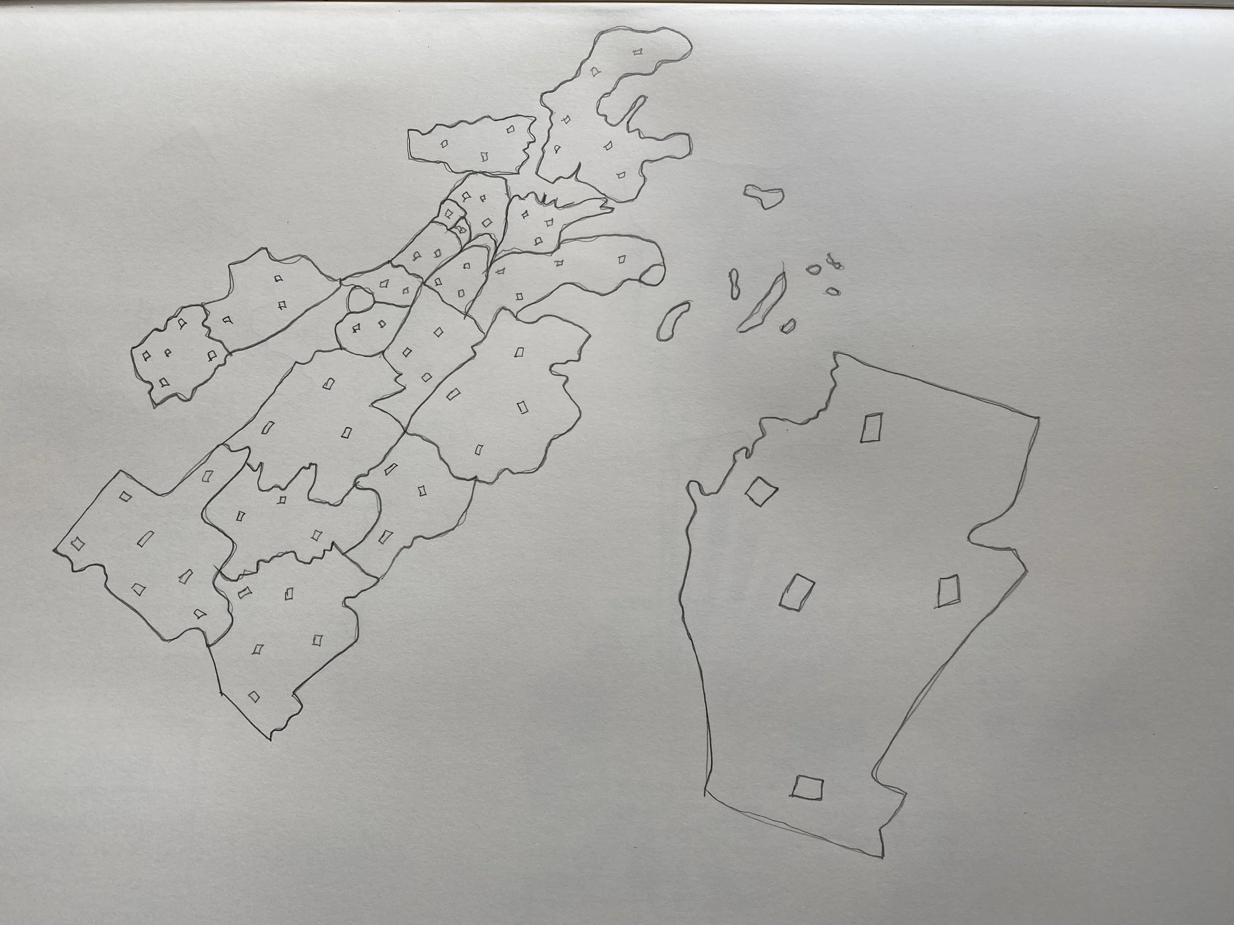
3. Then I looked at the tags to check which tags were used the most in conversations.
2. Does wealth play a big role in where these issues were happening? I was trying to figure it out what is the data telling me.

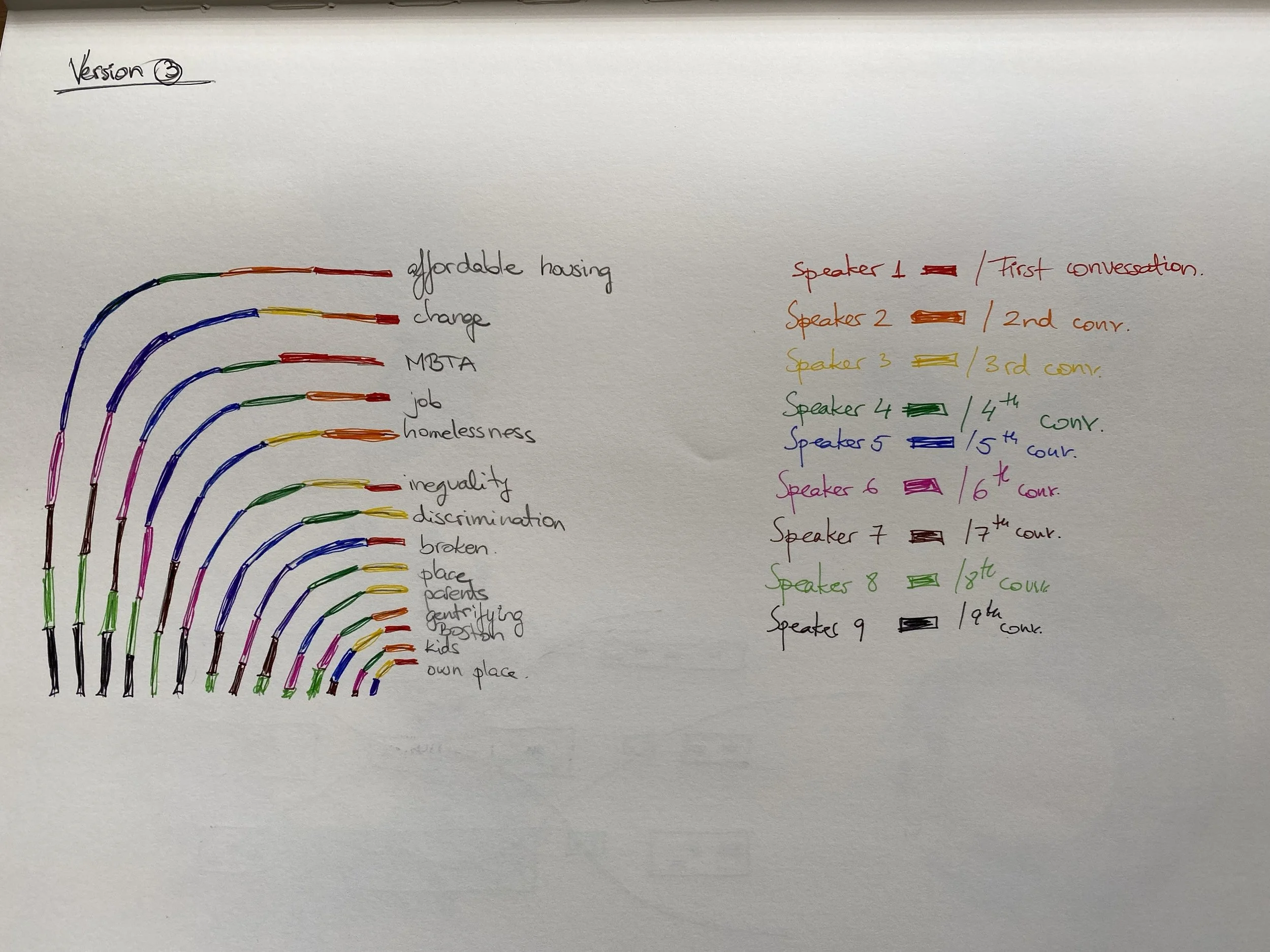
4. Then I thought of designing a lot of rectangles where each meant one conversation and the lines show how these conversations are connected to each other. Each little highlighted rectangle represents a specific theme that was found in those conversations. This design that got chosen to be implemented because it showed our audience the total amount of the conversations and it allowed users to see an overview of all the main issues.
Solution
Our solution was to go out and have conversations with people from underrepresented communities and to give them a ‘voice’. We decided to represent their voices through a website that included a visualization to make it accessible for everyone.
Initial View of all conversations
Clicking on the buttons to discover the connections
Listen to conversations
Mockups
Interaction
Data visualization using the actual data
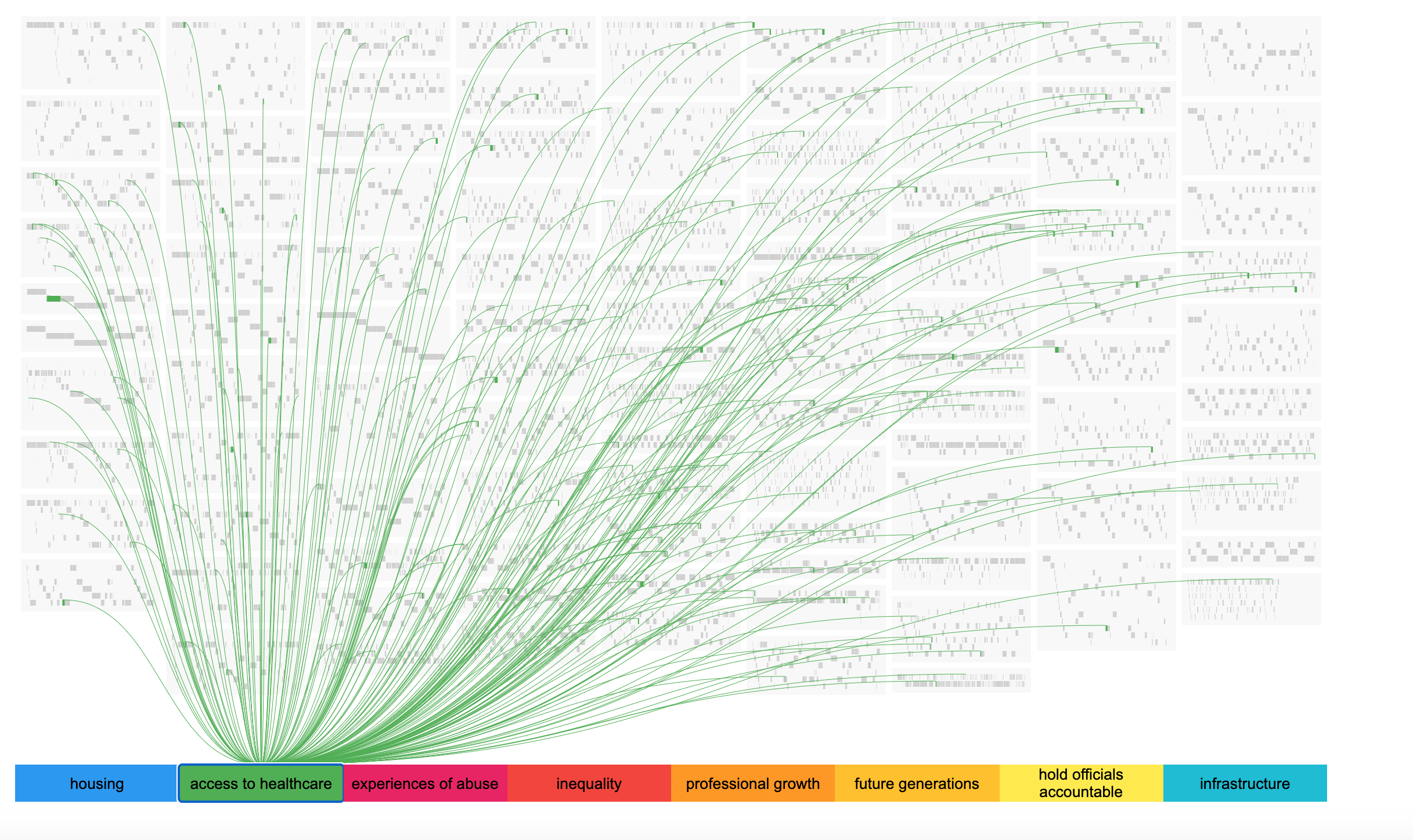
After iterating over the initial mock-ups, I wanted to test this design with the actual data, to see how everything would look in practice. Here you can see the first iteration that was focusing on showing all conversations and how they connect to a theme. At an initial glance this looked a bit overwhelming, but also clearly showcased how wide-spread this particular theme of access to healthcare was.

Icons & Colors
The team and I decided on these colors & logos for the actual visualization buttons. We wanted to create a cohesive look.
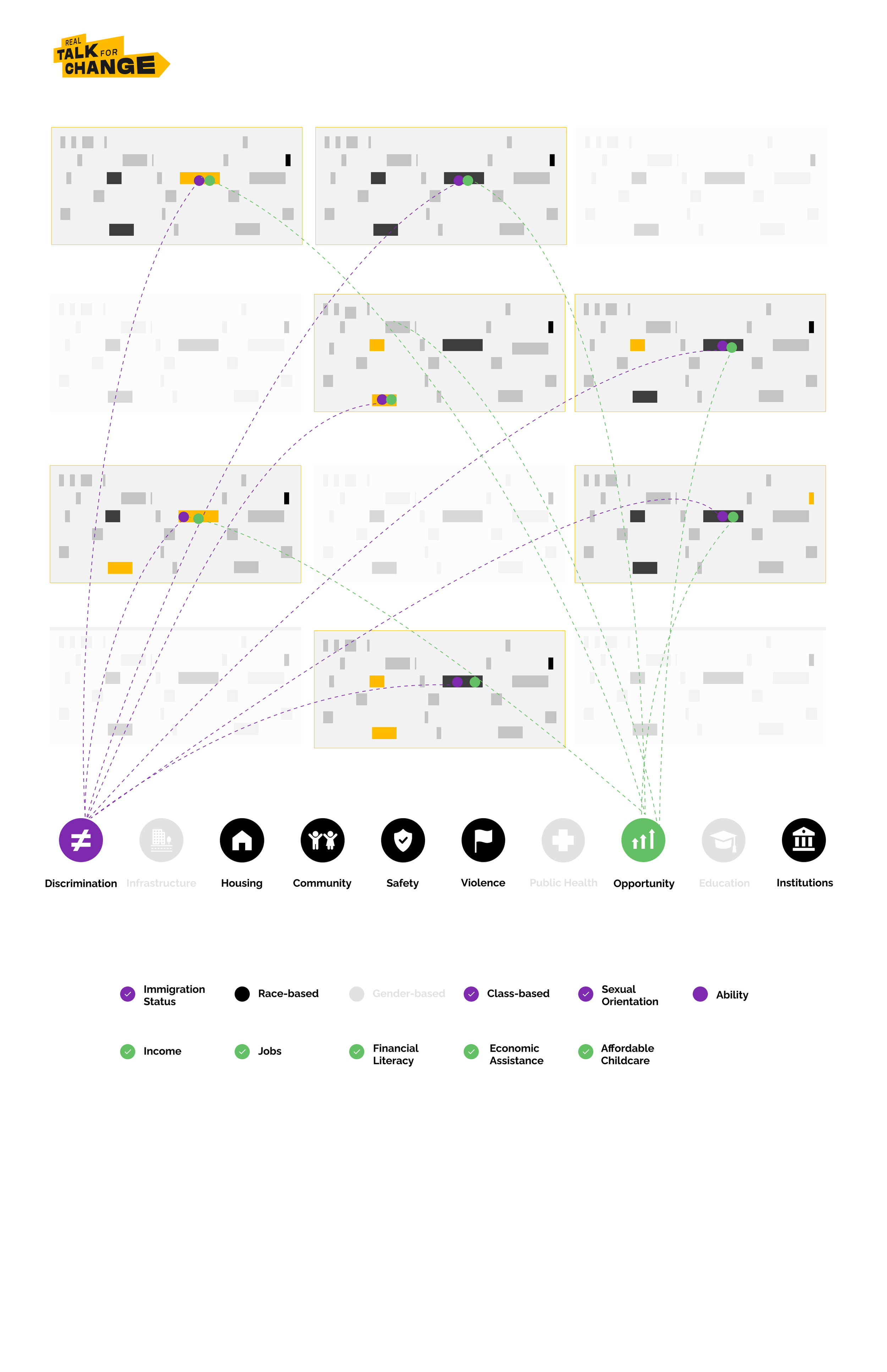
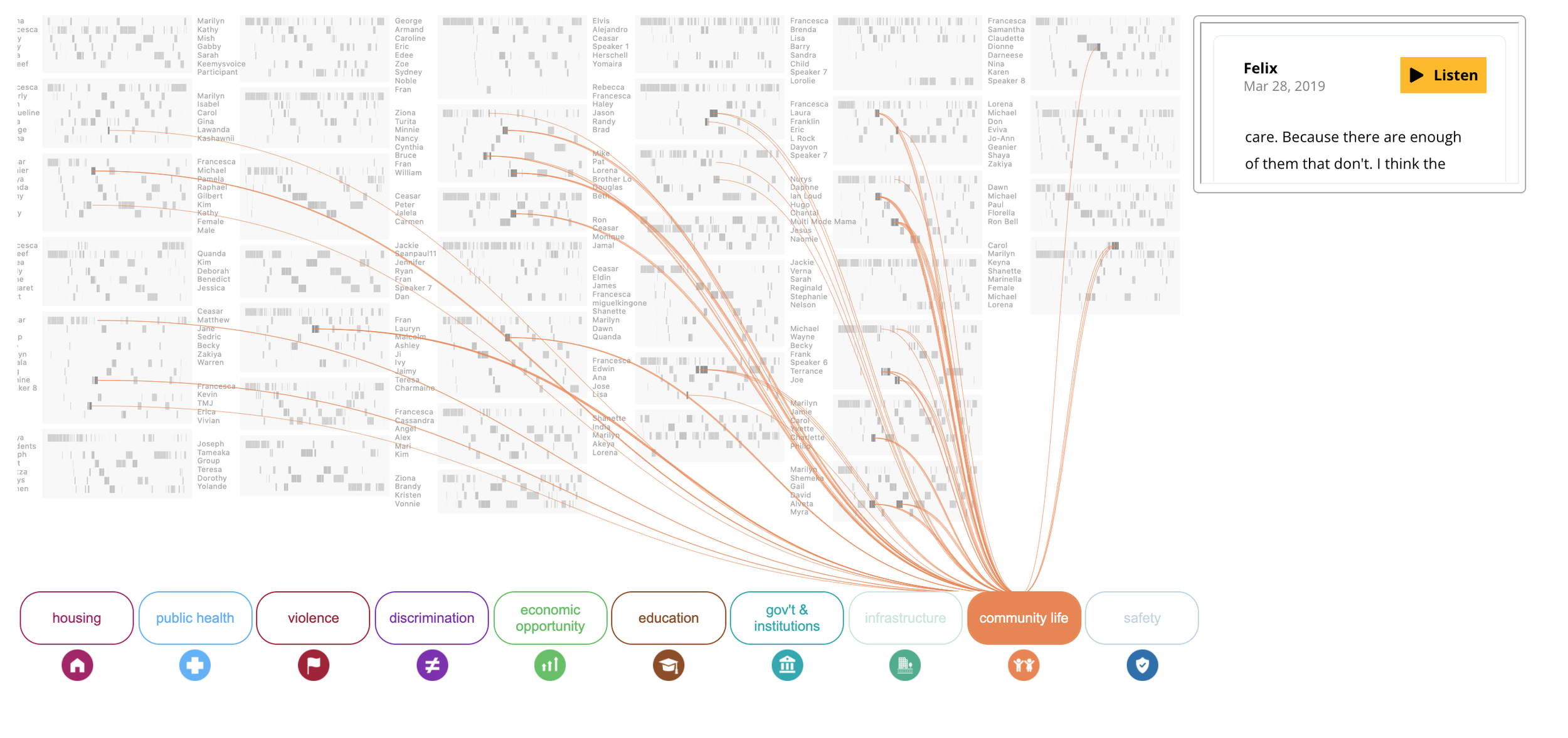
Based on the stakeholder’s feedback, on the next iteration I focused on the interaction and how I could make it easier to be used. As you can see here I changed the themes to visually represent buttons, and when one is selected, clearly indicates that it is active. I added the speaker names next to each conversation to make it easier to understand that each of the grey boxes represented a full conversation with multiple people. It also allowed the user to click on each snippet which would show the small info box on the right with the actual conversation.
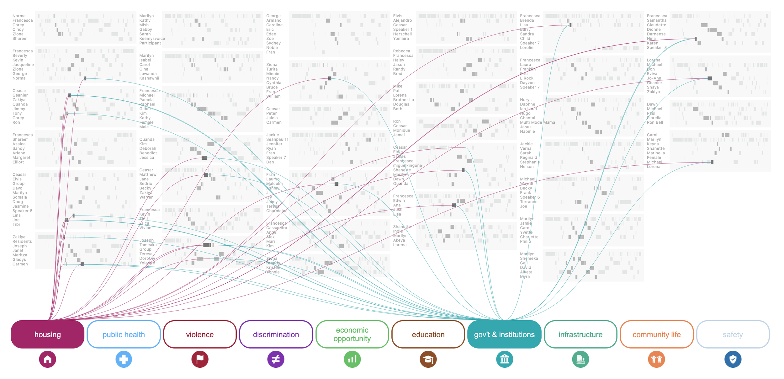
Here is the last iteration, where we are allowing multiple themes to be clicked on at the same time providing a more rich interaction with the data.
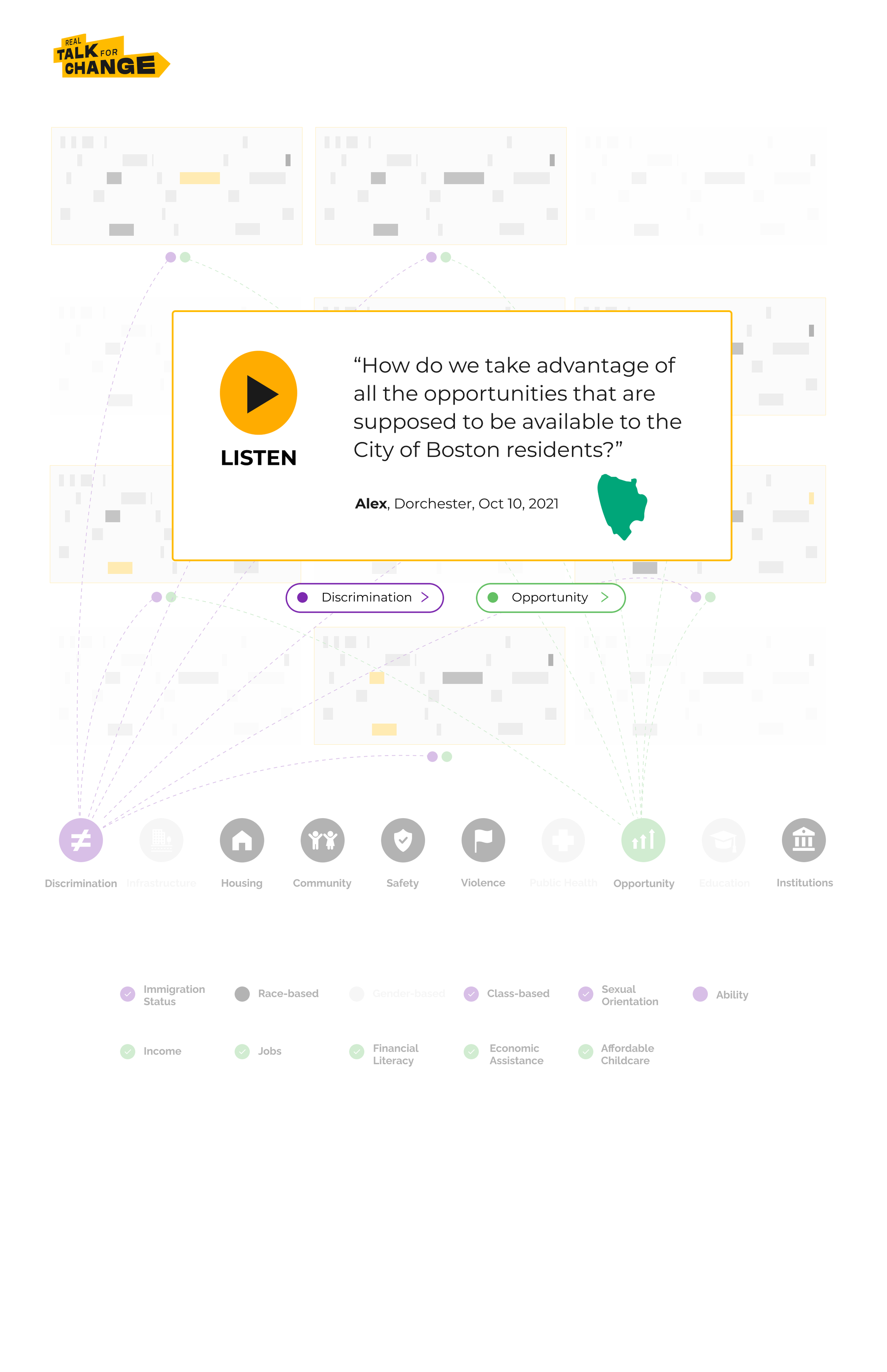
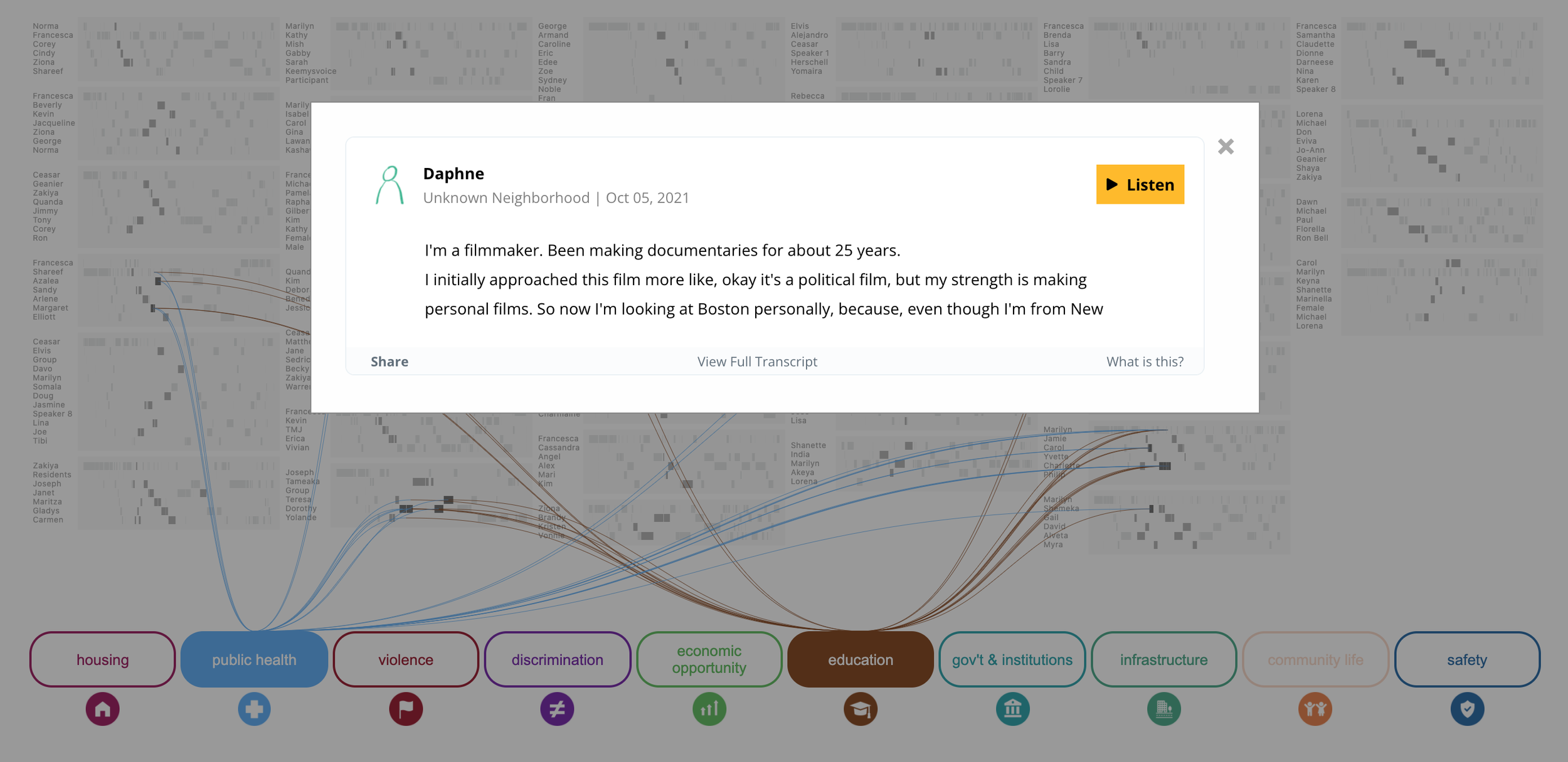
I removed the box on the right in preference of a dialog box, which would pop up once the user clicked on a snippet. I did this to provide a more detailed and focused experience of the each snippet. This dialog box would also be used to add additional information about each speaker and snippet.
Final Data Visualization
Here is a video of a user using the visualization platform. The user is hovering on the themes to see where they are in the conversations. Then clicks on the discrimination and education buttons to explore the snippets that include both of those themes. You can hover on one of the snippets and explore that part of the snippet, or click on the snippet which opens the dialog box, which allows the user to listen to the full snippet and see all the themes that were found in it.
RTFC Website
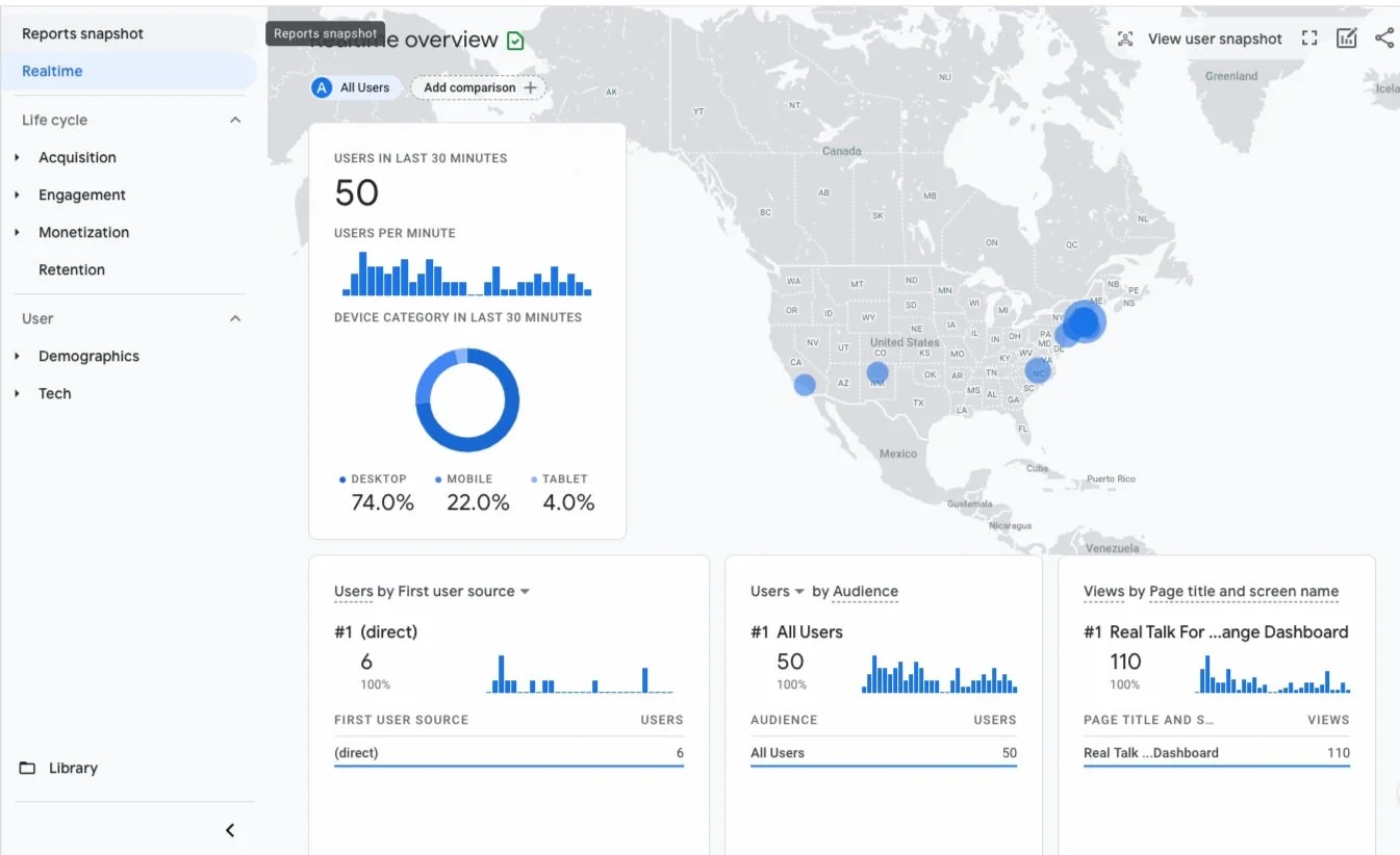
Website Analytics
The RTFC portal was widely used not only by Bostonians, but also by people living in other states in the United States. Here is a screenshot of the analytics.
Impact
MIT Media Lab received a lot of good press about our project. President Obama praised our lab MIT CCCs work calling the work we did “great work” in his speech at Stanford University 04/21/22.
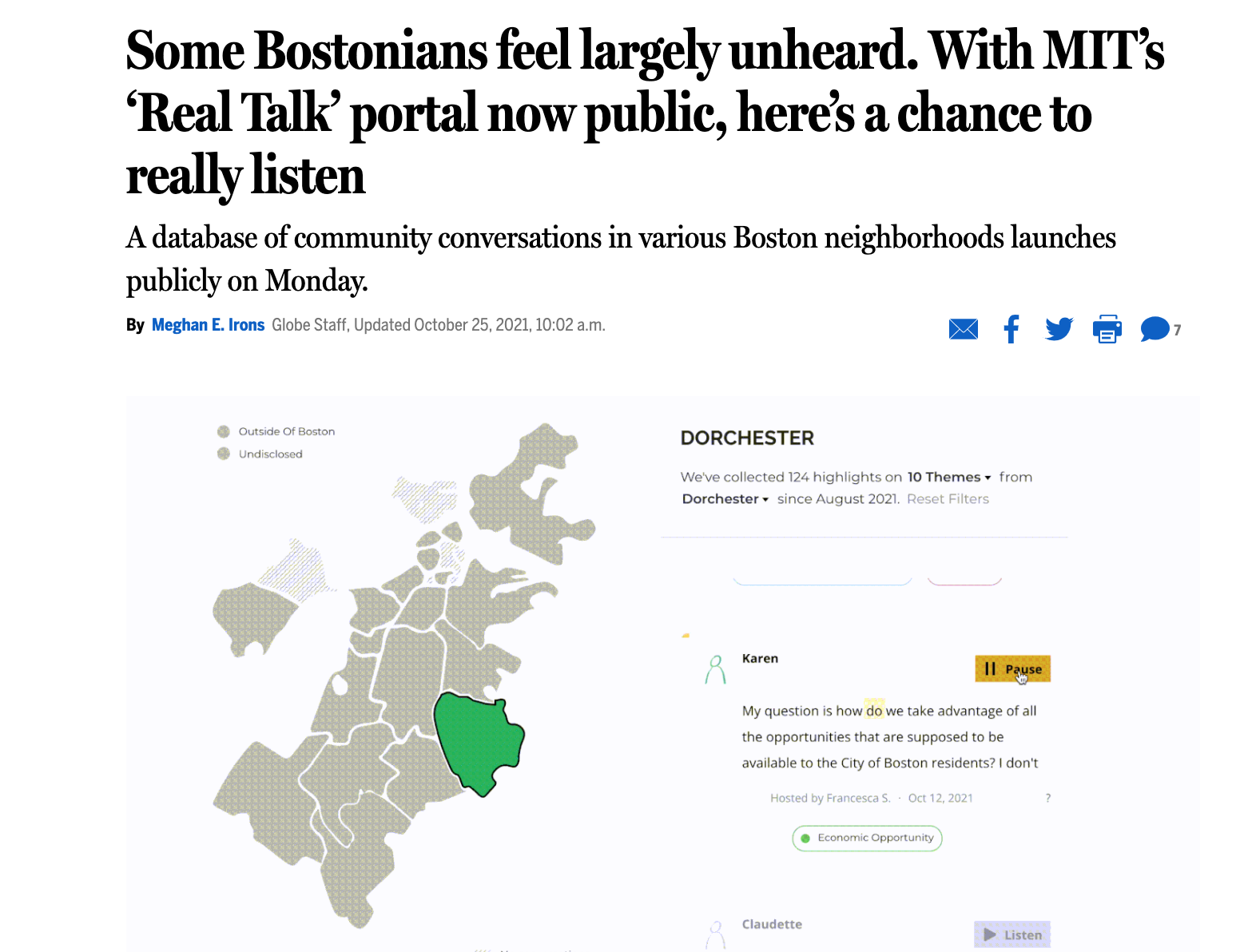
Boston Globe wrote about the fact that Bostonians feel largely unheard and how our project Real Talk helped bridge the gap between underrepresented communities and government authorities.
Takeaways
This project meant a lot to me because it gave me the opportunity to put my skills to better use and do something good for the world. At MIT Media Lab I had the opportunity to talk to underserved communities in Boston, do extensive research and design a visualization based on the data that we gathered. I learned a lot about the ethics around working with data. I learned to always be truthful to the data so I can tell the most compelling and true story. By giving a voice to underrepresented communities, I believe we can make an impact and make our communities stronger and safer.