Diagnostic Outcome Rates
Company: Intuitive Surgical
Category: Product Design / Data Visualization
Team: Data Scientist (data), Interaction Designer, Product Designer (myself) end-to-end data visualization design
Role: End-to-end design (sketches, Figma, coding D3)
Date: May 2024
Project Summary
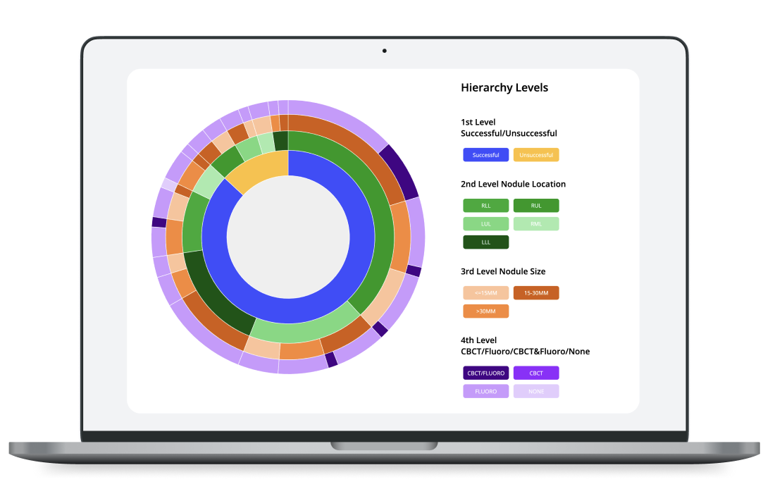
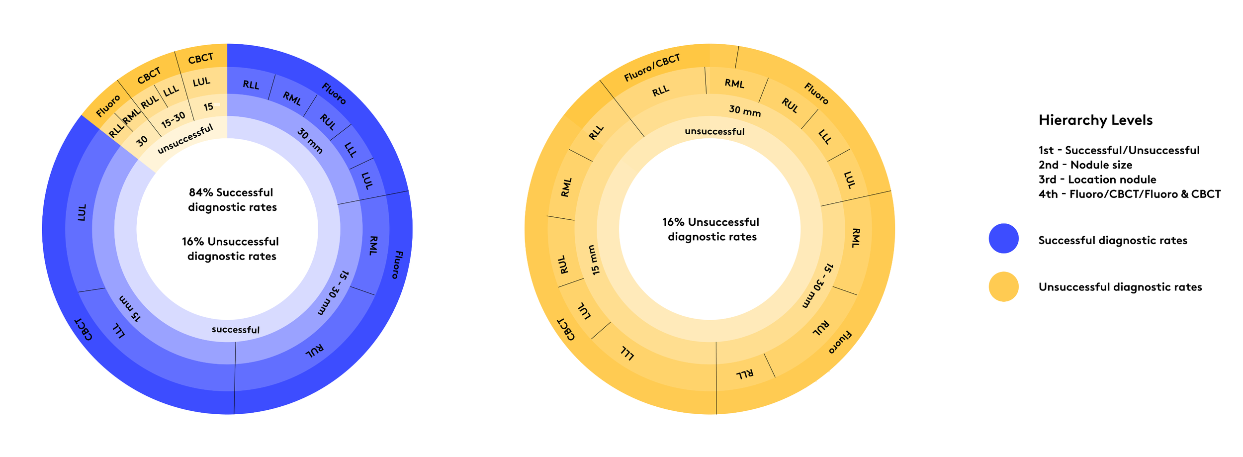
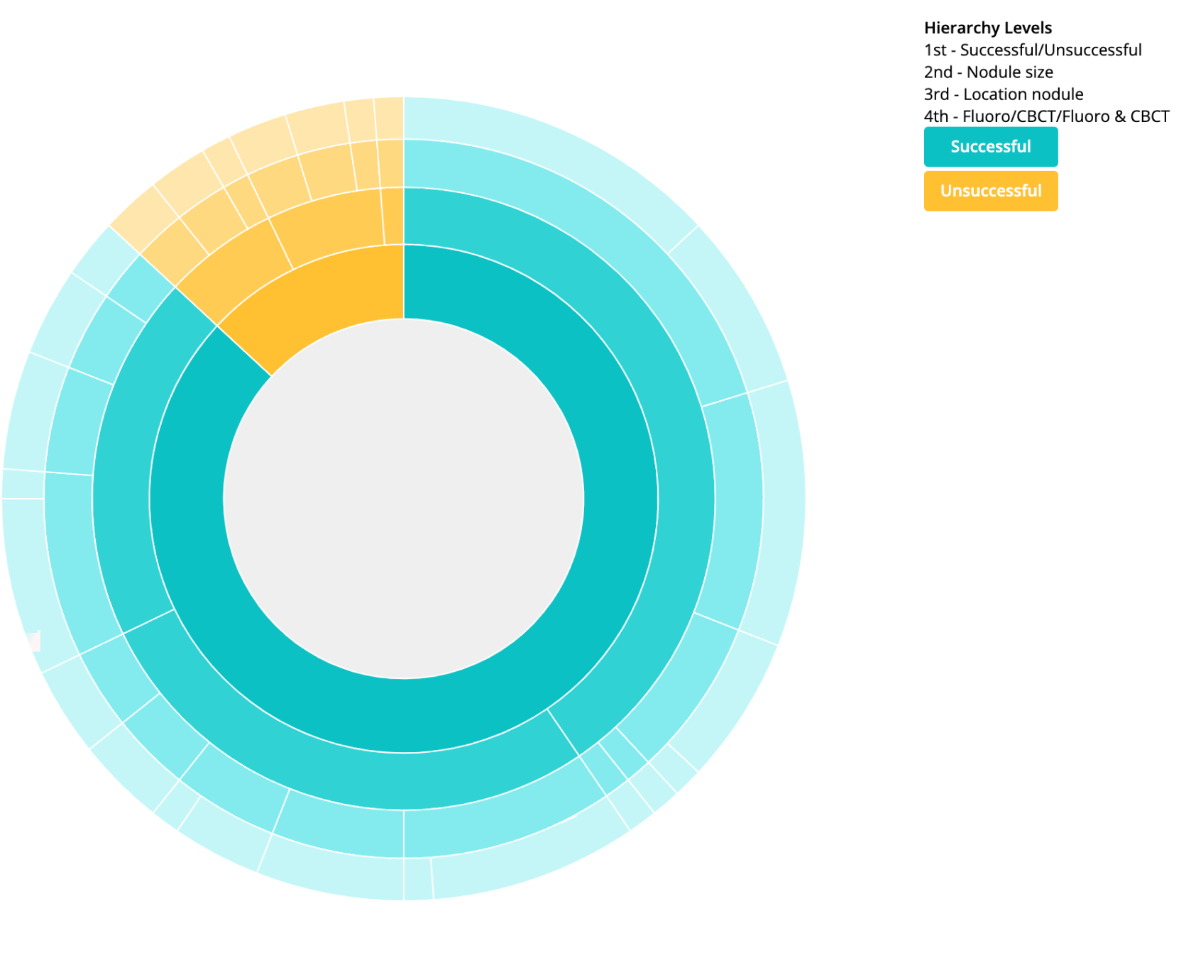
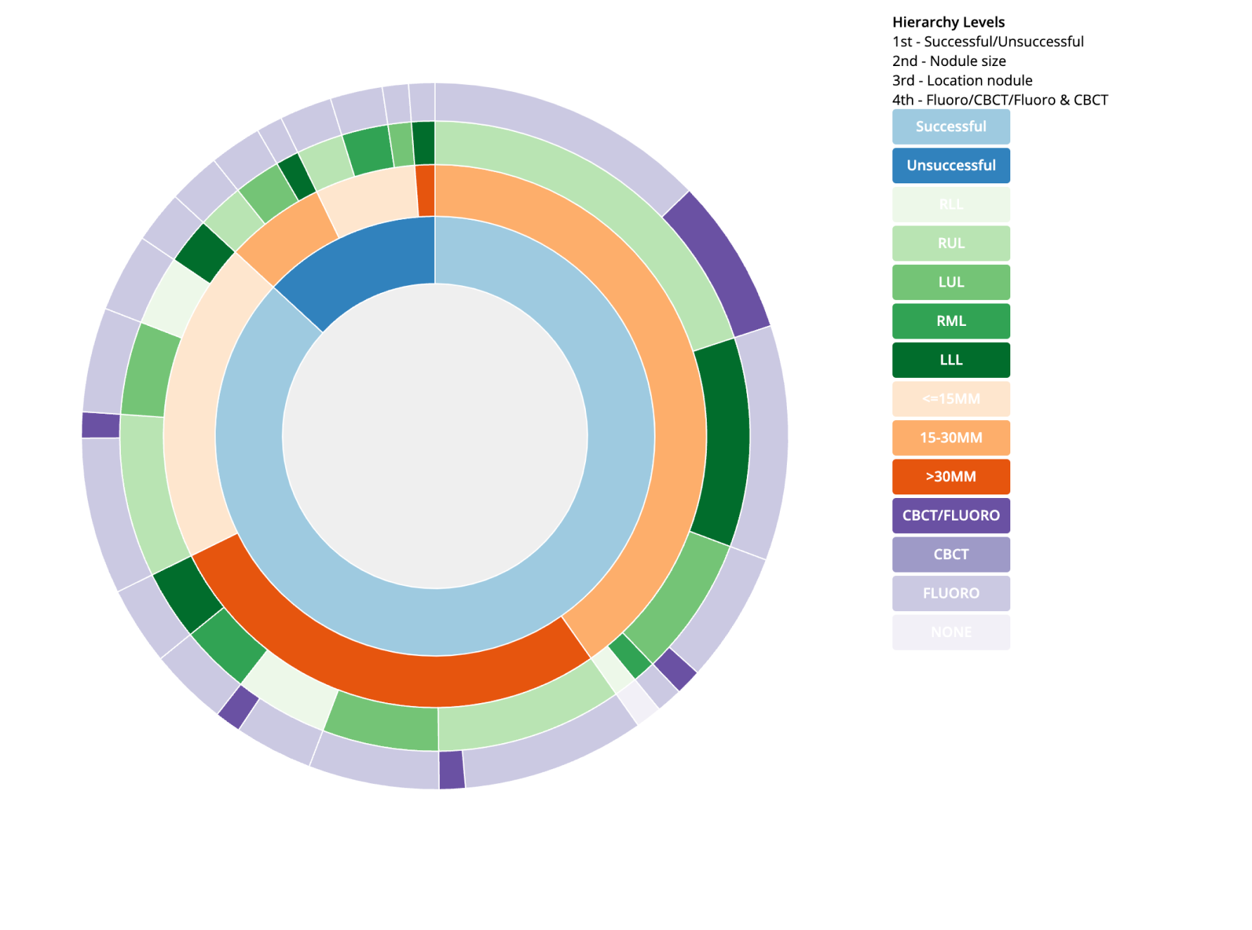
Designing the Diagnostic Outcome Rates in My Intuitive app by prototyping with real user data to show the factors that contribute to a successful outcome rate. This visualization is a overview of the diagnostic outcome for one Physician spanning over 2 years from 5/2021 - 6/2023. It is a POC meant to show patterns in the diagnostic outcome as well as relationships between the diagnostic outcome, nodule size and location.
Problem
How might we get surgeons comfortable with robotic-assisted technology in order to provide better medical outcomes?
Data Analysis
Does user data actually shows a pattern?
Personas
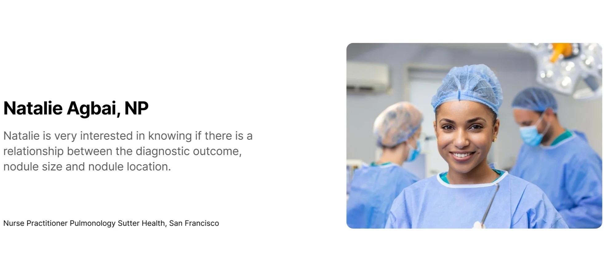
As a pulmonologist, I want to walk away with a diagnosis after each biopsy. For that to happen, I need to get to the accurate location of the lesion, and extract enough samples. Sometimes, I am not able to get to the lesion, or sample enough tissues. My diagnostic outcome is usually lower in smaller lesions in certain lobes of the lung. This may affect my future decisions on which imaging modality to use for these types of lesions.
Hand Sketches
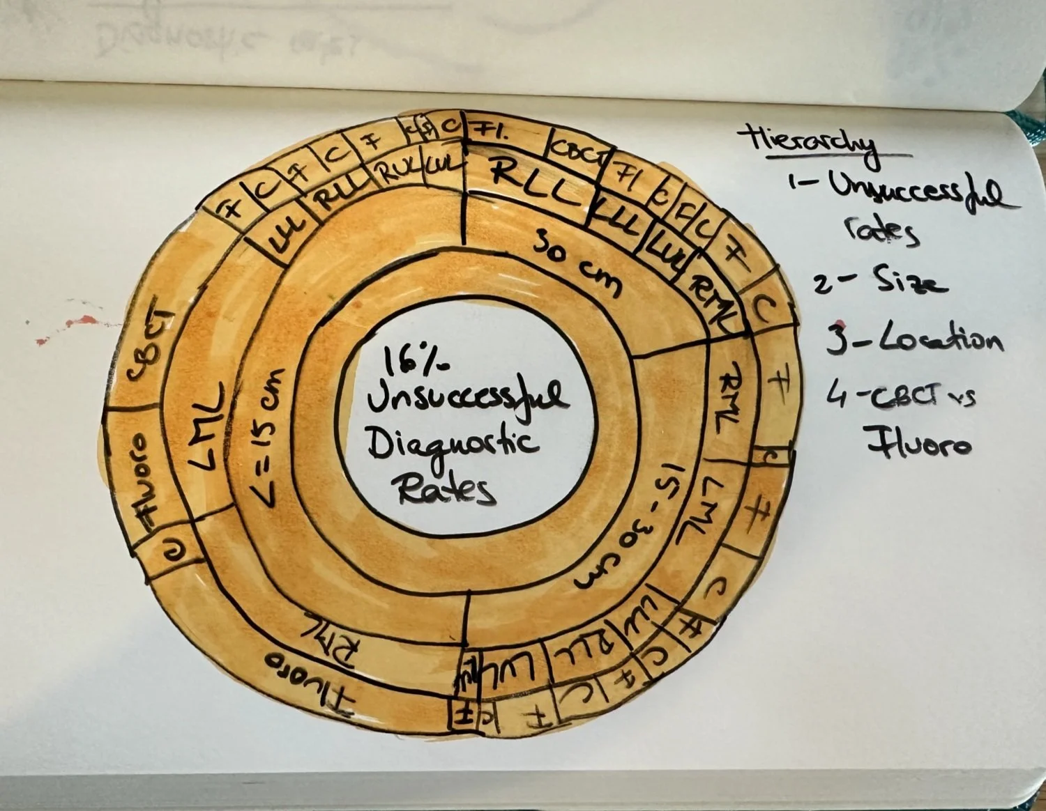
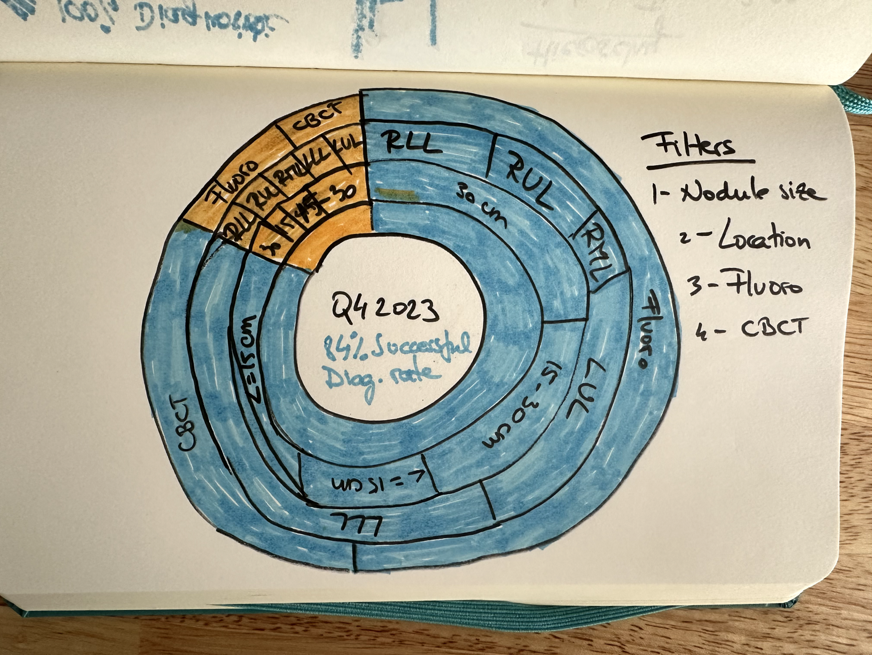
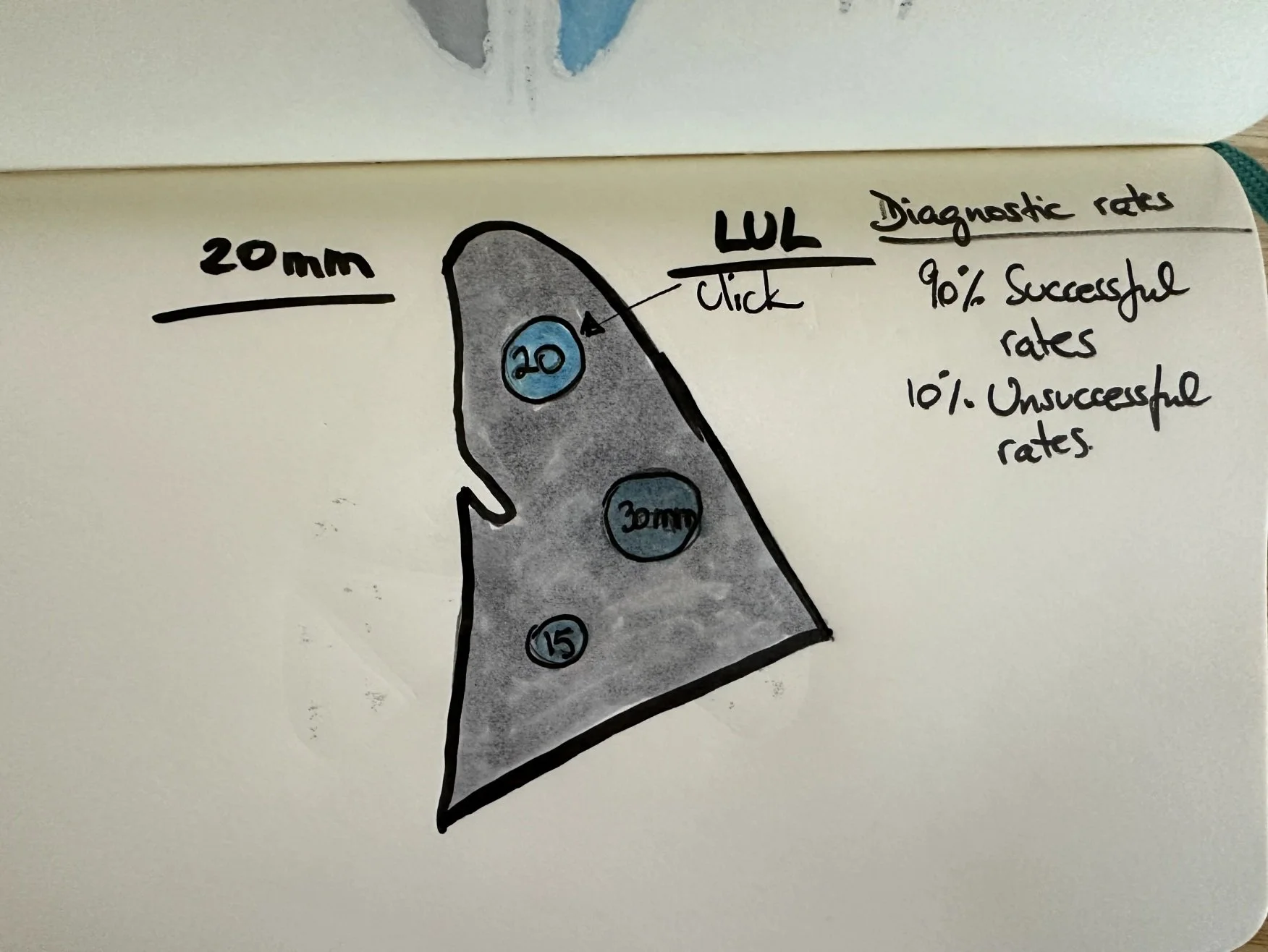
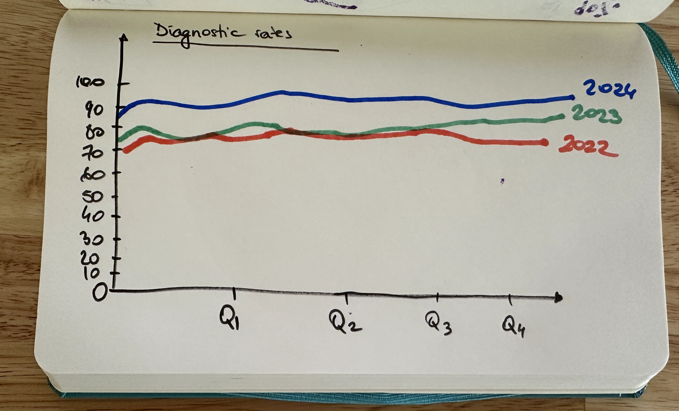
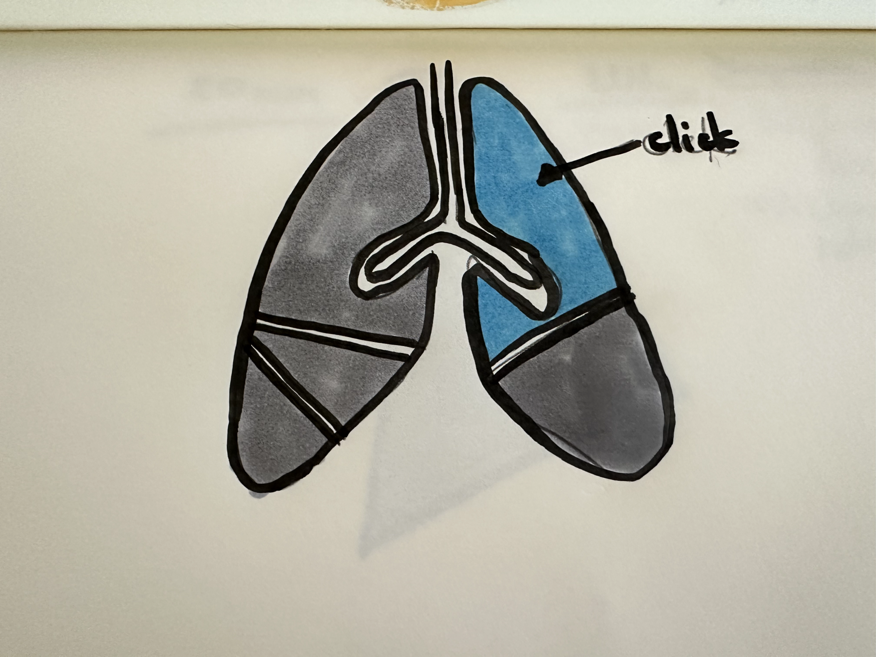
The first thing I like to do when I start designing the product is to sketch by hand how would this visualization might look. My first idea was to design a sunburst visualization, a radial bar, a lung design and a line chart. These options were all presented to stakeholders and the sunburst visualization got chosen to be implemented.
Figma Prototype
Diagnostic Outcome Rates Physician A
Unsuccessful Diagnostic Rates Physician A
Exploring Colors and Legend Design
After the first design prototype I started coding the visualization in D3.js.
Final Data Visualization Design
I fine tuned the code based on feedback from stakeholders and this is the final design for Physician A and Physician B.
Diagnostic Outcome Rates
Prototype
This is the latest version of the data visualization that I designed and prototyped. The physicians can visualize their diagnostic outcome rates and how they can improve and get to a 100% diagnostic rates.
Takeaways
This project was very complex and it allowed me to learn a lot about pulmonologists and how they work. I learned to design for high stake products and users. Innovation doesn’t happen overnight and that it takes years for users to adopt it. Good design is important to improve adoption rate. Lastly, I learned that there is hope in early detection and curing of lung cancer.

