Nautilus
Company: L2 (Gartner)
Category: Data Visualization
Team: Myself
Role: Data Visualization Designer
Date: August 2016
Background
During the summer in 2016 I was hired as a Data Visualization Designer Intern at L2 (Gartner) to visualize their digital IQ brands. My role in this project was to design and implement this visualization. This digital IQ ranking is given by L2 to each brand using very strict metrics and it basically represents how ‘smart’ was each brand digitally.
Problem
The problem I tried solving here was - how can we show in the most effective way a comparison of the brands digital IQ number? The users were all L2 members meaning all big brands who want to see in a fast and efficient way how well they did in 2016 when I designed this visualization.
Current Design
L2 used to show this data set in this design every year to their members. The stakeholders challenged me to design this data in a completely different way.
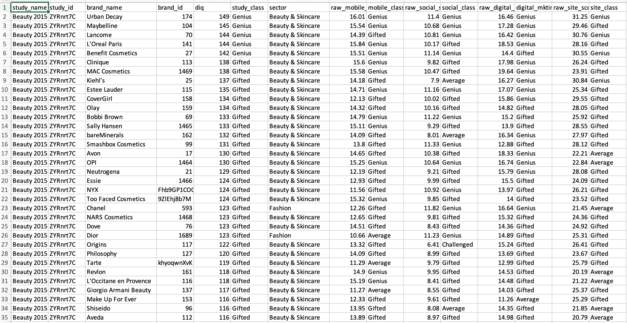
Gathering Data with SQL
The first thing that I did was to pull the data using SQL. I pulled the data for 180 brands which all have different sectors, they have about 24 sectors and a specific ranking done by L2 that shows how these brands did in their mobile, social, digital and site class. L2’s business model is a subscription model, where brands pay a monthly subscription. The first thing that I usually do is look at the data and try to see what’s weird in it, what is this data telling me and how can I visualize it in a way to be better understood.
Understanding the Data & Research
I started looking at the data’s categories as well as the metrics to try and figure it out what is this data telling me and how can I take it from one form (Excel spreadsheet) and put it into another form (visual design) to be better understood. The I started researching how these brands did in their previous years to try and gather as much information as possible to be able to design this data it in a beautiful and effective way.
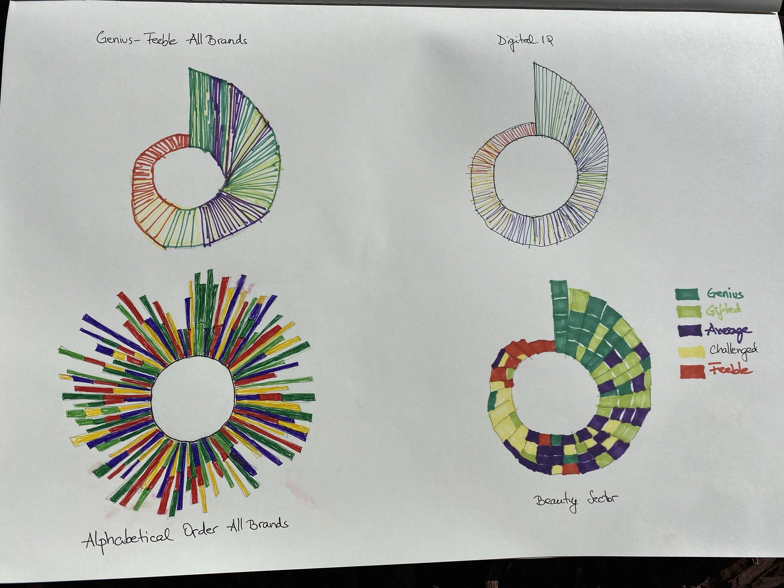
Design Discovery - Sketches
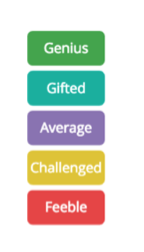
One of my favorite parts in the design process is to sketch by hand a lot of ideas and see how would they look and show them to the stakeholders. So I thought of mapping the data on a circle, where each brand would represent a radial bar and I would use colors to show the ranking. My first idea was to show all 180 brands sorted from genius to feeble. Genius means the brand did very well and is represented with green and feeble means the brand didn’t do very well and is represented with red. Another idea was to sort these brands by their Digital IQ number. Then I thought of showing the brands in an alphabetical order on the bottom left side from A to Z. I designed how each sector would look if we were to sort the brands from genius to feeble.
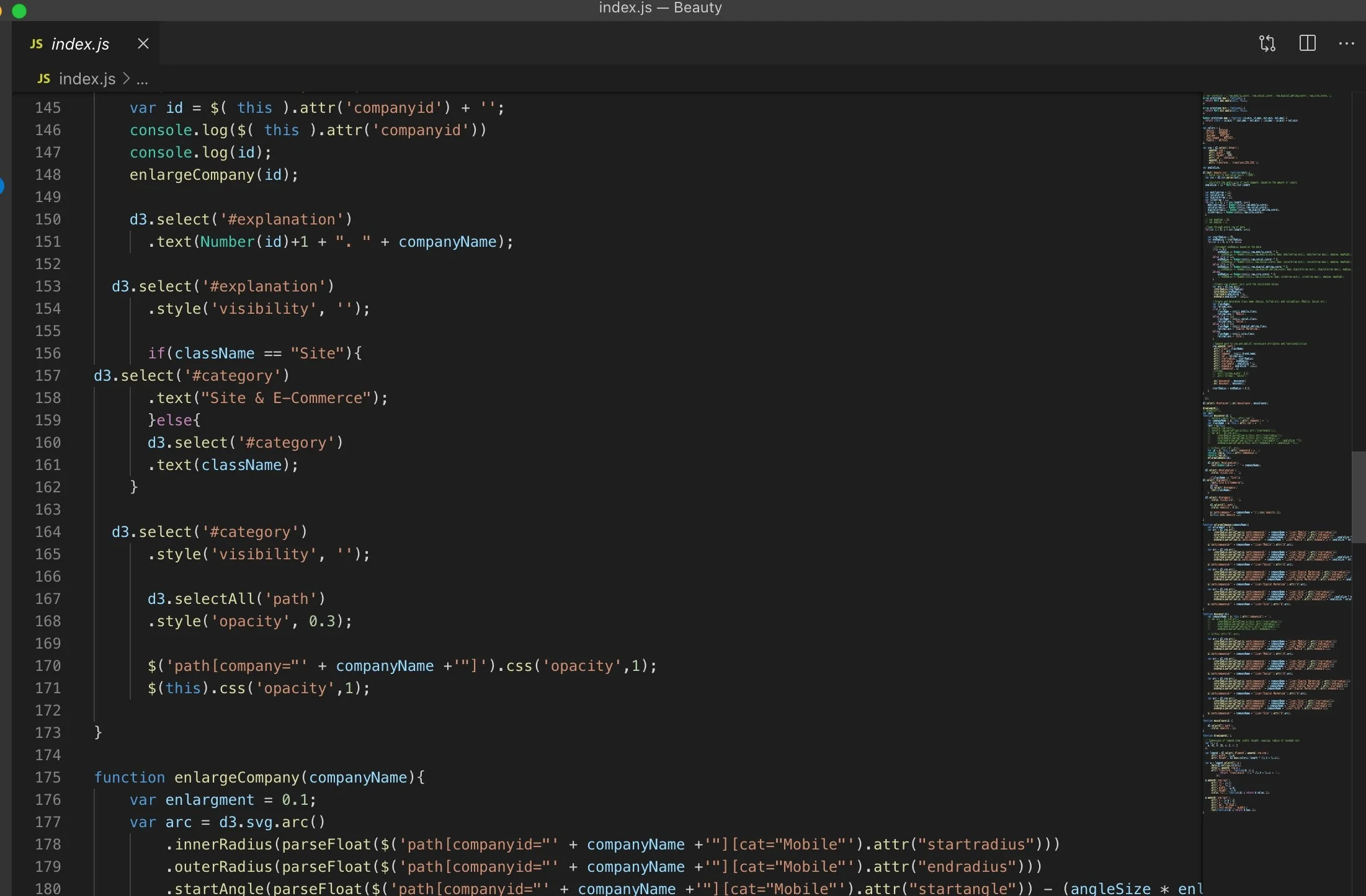
Coding using D3.js
After sketching how this visualization would look like, I wanted to connect the data so I started coding the project using D3.js.
All Brands Alphabetical Order
After sketching, I wanted to try and see how the data would look when I implement my design. So I visualized this data in 4 different ways. In the first design I’m showing all brands in the alphabetical order just like in my sketch. Each bar represents a brand and it is split up in the 4 ranking categories and color coded: site, digital, mobile & social.

All Brands from Genius to Feeble
In this design I was proposing to see all 180 brands from genius to feeble.
All Brands sorted by their Digital IQ Number
This was the idea to sort the brands by their digital IQ number like my sketch. Visually I liked this version a lot.
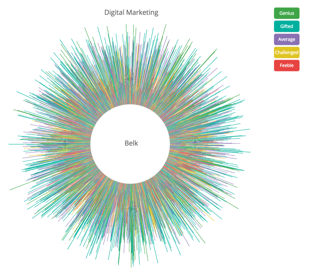
All Brands by Category
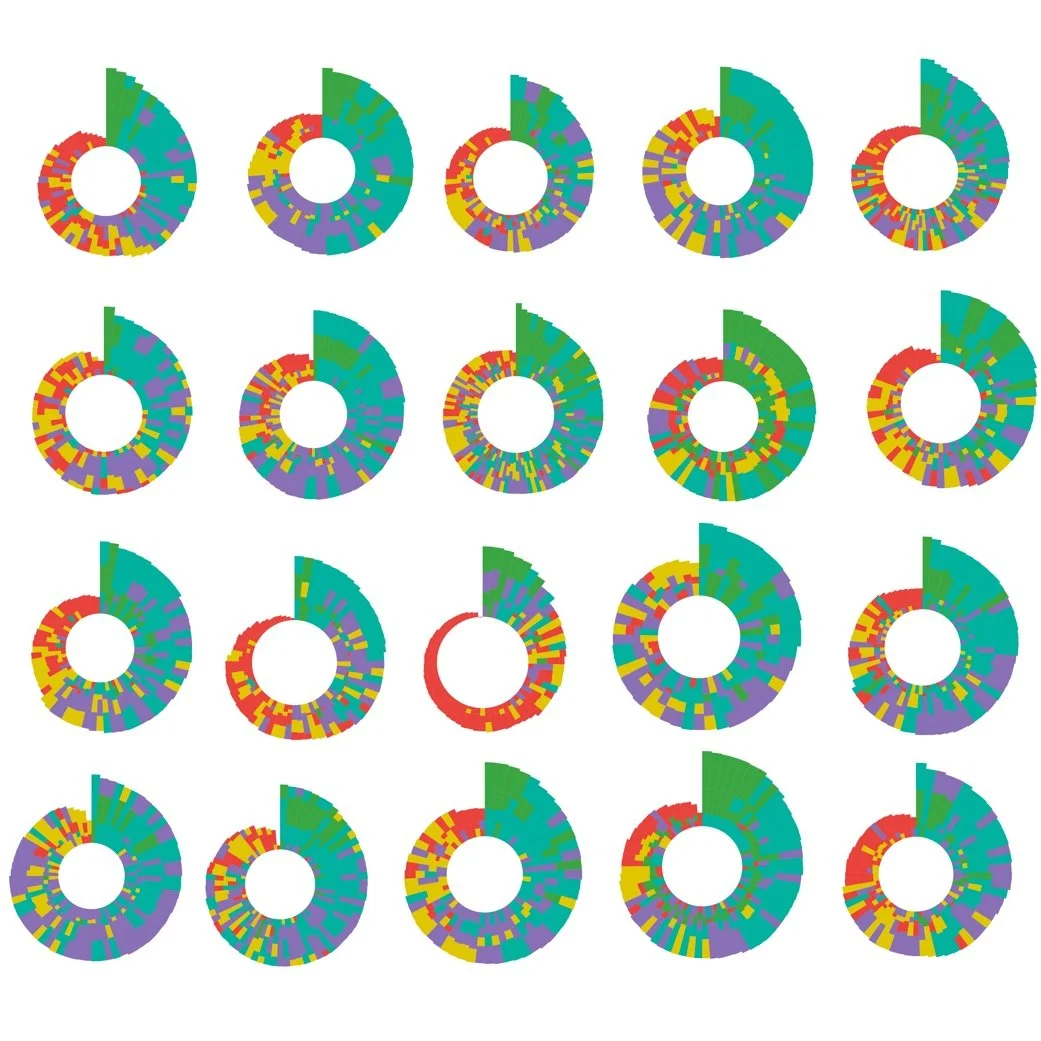
This was the last version that I designed and this version got chosen to be implemented by our stakeholders, which was showing all brands grouped by their category just like a flower petal and sorted from genius to feeble. This version was chosen because it allowed the user to drill in and see each sector and how well these brands did in these 4 categories: site, digital, mobile & social.

Designing Each Sector Individually
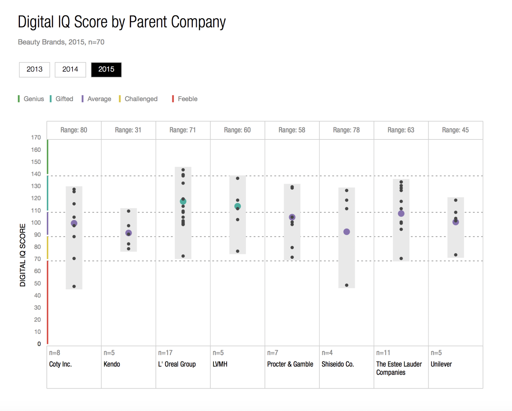
After the stakeholders decided on the ‘flower petal’ category design, I started thinking and designing each of their sectors. This is their beauty section that I designed and implemented where each bar represents one brand and it’s split up in 4 categories. As you can see here there’s less data and it’s easier to be comprehended.

Here are some of the other sector France beauty, beer sector and big box.
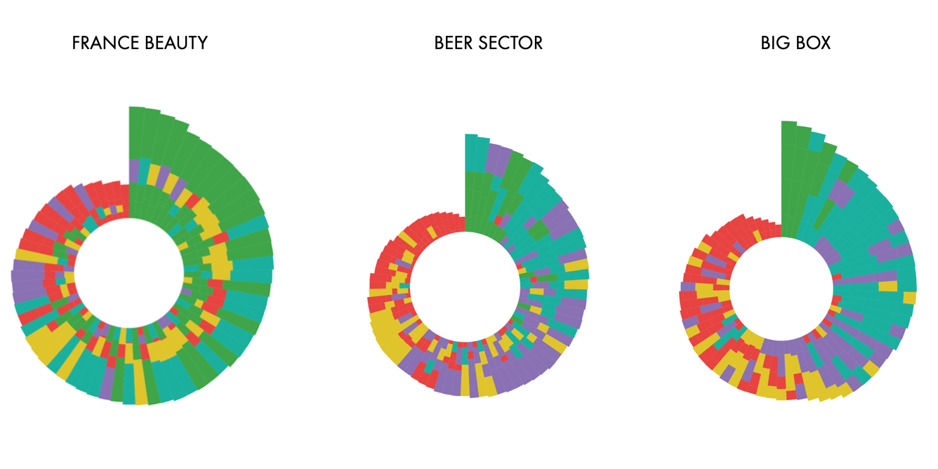
Other sectors where you can see the design ended up looking so different from Korea Luxury to Specialty Retail based on how well the brands did.
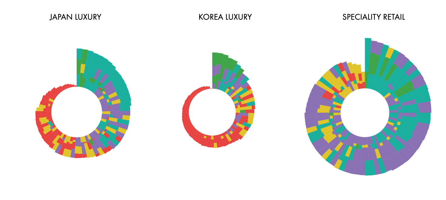
Then I designed all their 24 sectors to see a fast comparison between brands and which one had the most ‘genius’ brands (the most green ones) and the result was France Beauty.
I integrated my visualization into the L2 website so their members could easily visualize how well their own brand did in comparison to other brands.
Final Product & Impact
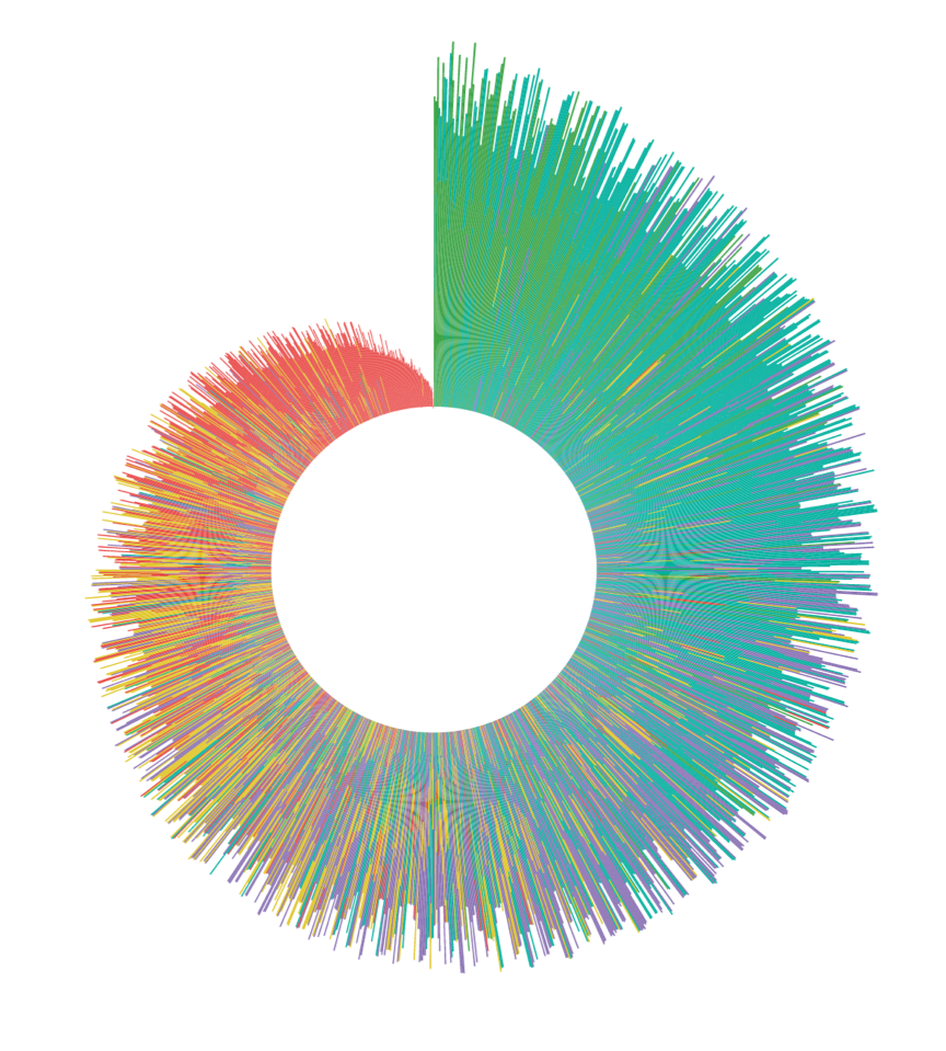
This is the final visualization that I designed and built. I added a legend on the left side so L2 members can understand each brand’s classification, each dimension that we looked at and how do we interpret a Digital IQ number. L2 members perceived this visualization very well as the data insights and visualization was meaningful for each member as a brand and also as a comparison to other brands. L2 committed to have more visualizations like this in the near future for their members as it meant a new way of showing a data set.

Takeaways
This was my first data visualization project at a company. I learned that sometimes one has to learn to do it all. During my time at L2 I learned SQL in order to pull the data so I can visualize it. I learned to transform the data so I can manipulate the design, I learned that a ‘pretty’ data visualization doesn’t mean a useful one and that in order to be useful, a visualization has to be impactful, has to easily tell the data insights and have an easy user flow and a nice visual component and design.